24/05/23 - 05/07/23 / Week 8 - Week 14
Azriq Anwar Bin Saprudin /
0353272
Advanced Typography / Bachelor of Design (Hons) in Creative
Media
Task 3: Type Exploration and Application
LECTURES
Lectures 1 to 5 in
Task 1 / Exercises: Typographic Systems & Type & Play
INSTRUCTIONS
Task 3: Type Exploration and Application
For this task, we were given the freedom to propose our own project. We were
required to either research the usage of typeface in our field of interest
or develop a typeface to address a challenge in that area. The final product
would be the developed typeface used in whatever medium relevant to the
problem being solved.
Final Project Ideas
Chosen Idea
Revival Typeface

|
|
Fig 1.1 Proposal, Week 9 (31/05/23)
|
The idea was to revive vernacular typefaces. These typefaces can usually
be found at old shops, hotels and offices from around the whole of
Malaysia. Since these typefaces have limited characters, the idea was to
recreate the typeface and later on be slightly modified. The purpose of it
was to be applied on modern signages.
Typeface Process

|
|
Fig 2.1.1 Grid System, Week 10 (07/06/23)
|
I created this grid system to in order to have a consistent typeface
throughout the process.

|
|
Fig 2.1.2 Typeface Process, Week 11 (14/06/23)
|

|
|
Fig 2.1.3 Typeface Process, Week 11 (14/06/23)
|

|
|
Fig 2.1.4 Typeface Process, Week 12 (21/06/23)
|

|
|
Fig 2.1.5 Typeface Process, Week 12 (23/06/23)
|

|
|
Fig 2.1.6 Number 4 Typeface Process, Week 12 (23/06/23)
|
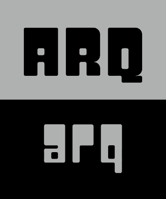
Final Typeface

|
Fig 2.2.1 Final Typeface, Week 14 (05/07/23)
|
I had a bit of a problem keeping the consistency of the lowercase of the
typeface but eventually I figured it out by having the top part of the
typeface the same thickness as the uppercase letters.
FontLab Process

|
|
Fig 2.3.1 Transferring to FontLab 7, Week 14 (05/07/23)
|

|
|
Fig 2.3.2 FontLab Process, Week 14 (05/07/23)
|

|
Fig 2.3.3 FontLab Process, Week 14 (05/07/23)
|
|

|
Fig 2.3.4 FontLab Process, Week 14 (05/07/23)
|
|
Typeface Presentation Process

|
|
Fig 2.4.1 Typeface Presentation Process, Week 14
(06/07/23)
|
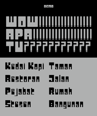
Typeface Presentation
|
|
Fig 2.5.1 Typeface Presentation 1, Week 14 (06/07/23)
|

|
Fig 2.5.2 Typeface Presentation 2, Week 14
(06/07/23)
|
|

|
Fig 2.5.3 Typeface Presentation 3, Week 14
(06/07/23)
|
|

|
Fig 2.5.4 Typeface Presentation 4, Week 14
(06/07/23)
|
|

|
Fig 2.5.5 Typeface Presentation 5, Week 14
(06/07/23)
|
|

|
Fig 2.5.6 Typeface Presentation 6, Week 14
(06/07/23)
|
|

|
Fig 2.5.7 Typeface Presentation 7, Week 14
(06/07/23)
|
|
|
Fig 2.5.8 Typeface Presentation 8, Week 14
(06/07/23)
|
|
Application

|
|
Fig 2.6.1 Signage Typeface Application, Week 14
(07/07/23)
|

|
Fig 2.6.2 Totebag Typeface Application 2, Week 14
(07/07/23)
|

|
Fig 2.6.3 Lightbox Signage Typeface Application 3,
Week 14 (07/07/23)
|

|
Fig 2.6.4 Poster Typeface Application 4, Week 14
(07/07/23)
|

|
Fig 2.6.5 Direction Signage Typeface Application 5,
Week 14 (07/07/23)
|
Final Submission
Fig 2.7.1 Final Task 3: Type Exploration and Application - PDF, Week 14 (07/07/23)
FEEDBACK
Week 14
Specific feedback: Have the top part of the lowercase the same thickness as the same as the uppercase letters.
REFLECTION
Experience
I like this task because I had the freedom to go in any direction that I want. It was both enjoyable and very challenging. This is my first time as well, designing a whole typeface.
Observation
I observed that creating vernacular typeface was relatively fun. Because its a vernacular typeface, I took the elements from the referenced typeface and modified it have a modern and vintage look.
Findings
Making a typeface is not easy. It's like you have to build a puzzle and trying to figure out which parts goes where. Because it feels like a puzzle, it was satisfying when all the puzzles are connected.
FURTHER READING
 |
Fig 3.1 The Viggeli Canon by Massimo Vignelli
|
Pages 80-83
Layouts
 |
| Fig 3.2 Layouts (Pages 82-83) |
Different layout specifications apply to every type of publishing. However, it is unavoidable that the layouts will convey the designer's vision. The designer's job is to go through the photographs to choose those that best capture the spirit of the material and have the potential to become an icon. Most publications are made up of text, images, and subtitles.

Comments
Post a Comment