Advanced Typography - Task 1 / Exercises: Typographic Systems & Type & Play
05/04/23 - 26/04/23 / Week 1 - Week 4
Azriq Anwar Bin Saprudin /
0353272
Advanced Typography / Bachelor of Design (Hons) in Creative
Media
Task 1 / Exercises: Typographic Systems & Type & Play
LECTURES
Week 1 - Lecture
Advanced Typography: Typographic Systems
The eight main variations of typographic systems are:
- Axial
- Radial
- Dilatational
- Random
- Grid
- Modular
- Transitional
- Bilateral
Typographic systems give the decision-making process a sense of direction
and emphasis.
A shape grammar is a set of shape rules that apply in a step-by-step
way to generate a set, or language, of designs.

|
| Fig 1.1 Axial system (source: type 365) |

|
| Fig 1.2 Radial system (source: type 365) |
Radial system: All elements are extended from a point of focus.

|
| Fig 1.3 Dilatational system (source: type 365) |
Dilatational system: All elements expand from a central point in a circular fashion.
|
|
| Fig 1.4 Random system |
Random system: Elements appear to have no specific pattern or relationship.

|
| Fig 1.4 Grid system (source: type 365) |
Grid system: A system of vertical and horizontal divisions.

|
| Fig 1.5 Modular system (source: type 365) |
Modular system: A series of non-objective elements that are constructed in as a standardized unit.

|
| Fig 1.6 Transitional system (source: type 365) |
Transitional system: An informal system of layered banding.

|
| Fig 1.7 Bilateral system (source: type 365) |
Bilateral system: All text is arranged symmetrically on a single axis.
Week 2 - Lecture 2
Advanced Typography: Typographic Composition
Principles of Design Composition: Emphasis, isolation, repetition, balance (symmetry/asymmetry), alignment, perspective, rhythm and contrast.
Advanced Typography: Typographic Composition

|
| Fig 2.1 Principle of Design - emphasis |
Principles of Design Composition: Emphasis, isolation, repetition, balance (symmetry/asymmetry), alignment, perspective, rhythm and contrast.

|
| Fig 2.2 The Rule of Thirds |
The Rule of Thirds: A photographic guide to composition. The intersecting lines are used as a guide to place the points of interest., within the given space.

|
| Fig 2.3 Environmental grid, Typographic design: Form and communication (2015) |
Environmental Grid: Based on the exploration of an existing structure or numerous structures combined.

|
| Fig 2.4 Form and movement |
Form and Movement: Based on the exploration of existing Grid Systems. The placement of a form on a page, over many pages creates movement. The forms could represent images, text or colour.
Week 3 - Lecture 3
Advanced Typography: Context and Creativity
The first letterforms created mechanically were intended to closely resemble
handwriting. Mechanical type would aim to imitate handwriting's shape, space,
and traditions as the foundation or standard.

|
| Fig 3.1 Cuneiform c. 3000 B.C.E |
The oldest form of writing, developed from pictograms, was written from left
to right.

|
| Fig xx 3.2 Hieroglyphs |
- Ideograms are representations of what they truly represent.
- Determining words' overall meaning and demonstrating the phonograms'
intent of the signals before them.
- The sounds that "spell out" particular words are represented as
phonograms.
|
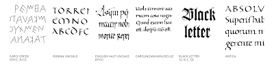
| Fig xx Letterforms through the ages |
Early Greek (5th C. B.C.E.): Drawn freehand, not constructed with
compasses and rules, and they had no serifs. In time the strokes of
these letters grew thicker, the aperture lessened, and serifs appeared.
Roman Uncials: By the 4th century Roman letters were becoming
more rounded, the curved form allowed for fewer strokes and could be
written faster.
English Half Uncials (8th C.): In England, the uncial evolved
into a more slanted and condensed form.
Carolingian Minuscule: Capitals at the start of a sentence,
spaces between words and punctuation. It was this style that became the
pattern for the Humanistic writing of the fifteenth century; this
latter, in turn, was the basis of our lower-case roman type.
Black Letter (12-15 C. CE): Characterized by tight spacing and
condensed lettering. Evenly spaced verticals dominated the letterform.
Condensing line spacing and letter spacing reduced the amount of costly
materials in book production.
The Italian Renaissance: Newly rediscovered letterforms Antica.
The renaissance analysis of form that was being applied to art and
architecture was directed toward letterform — resulting in a more
perfect or rationalized letter.

|
|
Fig 3.4 'Indian' subcontinent the Indus Valley Civilization (IVC)
script (3500-2000 BCE) |
The Indus Valley Civilization (IVC) script, which dates from 3500–2000
BCE and is the earliest writing discovered on the "Indian"
subcontinent, has not yet been decoded but appears to have had a
logo-syllabic structure.

|
| Fig 3.5 Brahmi script (450-350 BCE) |
India produced the first writing system after the Indus script. All
contemporary Indian scripts as well as several hundred other scripts
found in Southeast and East Asia are descended from Brahmi, one of the
most prominent writing systems.

|
| Fig 3.6 Southeast Asia script, scripts of the communities that assimilated into Peninsula Malay communities. |
Week 4 - Lecture 4
Advanced Typography: Designing Type
Advanced Typography: Designing Type
Type Design Process
1. Research
- Be familiar with the terminology, rules, and anatomy of type.
- Ascertain the type's usage, including its intended use and the many
applications to which it will be put.
- Research currently used typefaces to get ideas, inspiration, references,
context, usage patterns, etc.
2. Traditional and digital sketching
3. Digitization
Glyphs App and FontLab are professional software programmes. Some designers
don't just utilise the specialty font programmes; they also use Adobe
Illustrator. The purist, however, disapproves of this.
4. Testing
Testing outcomes are used to improve and rectify various parts of the
font. The testing process includes prototyping, which yields valuable
input. The readability and legibility of the typeface become crucial
factors depending on the typeface category (display type/text type). If
the typeface is a show type, where the expression of the shape is somewhat
more important, it is less important.
5. Deploy
There are always teething issues that were not evident during the
prototype and testing stages, even after a font has been deployed.
Therefore, revision work doesn't end with deployment. To ensure that the
teething problems are kept to a minimum, testing must be rigorous.
Typeface Construction
 |
| Fig 4.1 Construction grid for roman capitals (8x8 cells) |
Grids (with circular shapes) can make letterform building easier, and
using them is one way to build, develop, or design your letterform.
Construction and considerations

|
| Fig 4.2 Classification according to form and construction |
When creating a new type, various shapes and structures must be
considered. The extrusion of curving (and projecting) shapes past the
baseline and cap line (overshoot) is a crucial aesthetic adjustment.
This is true for the vertical alignment of shapes that are curved and
straight. Fitting the type: The spacing between the letters also
requires eye adjustment. The white space between the letters has to be
changed so that it is uniform in appearance.

|
| Fig 4.3 Ink traps |
When printing quickly and carelessly on inexpensive absorbent paper,
ink traps are typically utilised. The corners collect more ink, yet
with ink traps, the corners are still visible.
INSTRUCTIONS
Task 1: Exercise 1 - Typographic Systems
We are tasked to explore the eight typographic systems which are: Axial,
Radial, Dilatational, Random, Grid, Modular, Transitional, and Bilateral in
InDesign based on the MIB. We were then instructed to watch demonstration
videos on the exercise in the lecture playlist.
Requirements:
- Size 200 x 200mm
- Colors: Black and additional color
- Minor graphical elements
On our first week, we were instructed to play around the axial system. I attempted to do distinctive compositions as much as I can from one another. Also tried a variety of different fonts to try and fit the 'punk' aesthetic into the design.
For the random system, I attempted to create as much chaos as I possibly can but at the same time, trying to retain the readability of the context.
I first started adding color while I was doing the transitional system. I played around with the colors and settled on red. For the subtext I decided to fill in blacks and whites as a minimal element and as a directional wave to show the flow of the text.
I took this image. I chose this subject because in my opinion, organic shapes has a lot of potential letterforms hidden. I found the letters K, Y, A, N, E.
I worked on the letterform extraction on Adobe Illustrator. I used the pen tool to extract the letters. I tried to be as intricate as possible on tracing the branches' little details.
The font that I chose and referenced to refine the letterforms to was Futura Std Light
I placed the refined type into an image that I think, fits the aesthetics of the type.
After some feedback from Mr. Vinod, I added poster credits to the image to give it a more of a movie poster feel.
FEEDBACK
REFLECTION
Elam, K. (2007). Typographic Systems. Princeton Architectural Press, New York
Based on this text, I was able to comprehend typographic systems better. The design ideas of repetition, emphasis, and contrast, as well as their significance in strengthening the typographic systems, are also brought to mind.
Week 1 Practical

|
| Fig 5.1 Axial attempts #1 - Week 1 05/04/23 |

|
| Fig 5.2 Axial attempts #2 - Week 1 05/04/23 |

|
| Fig 5.3 Axial attempts #3 - Week 1 05/04/23 |
On our first week, we were instructed to play around the axial system. I attempted to do distinctive compositions as much as I can from one another. Also tried a variety of different fonts to try and fit the 'punk' aesthetic into the design.
InDesign Process

|
| Fig 5.4 Random System process - Week 2 12/04/23 |

|
| Fig 5.5 Random System process - Week 2 12/04/23 |
For the random system, I attempted to create as much chaos as I possibly can but at the same time, trying to retain the readability of the context.

|
| Fig 5.6 Transitional System process - Week 2 12/04/23 |
I first started adding color while I was doing the transitional system. I played around with the colors and settled on red. For the subtext I decided to fill in blacks and whites as a minimal element and as a directional wave to show the flow of the text.

|
| Fig 5.7 Grid and Modular System process - Week 2 12/04/23 |
Final Task 1: Exercise - Typographic Systems

|
| Fig 5.8 Final Axial System - JPEG, Week 2 12/04/23 |

|
| Fig 5.9 Final Radial System - JPEG, Week 2 12/04/23 |

|
| Fig 5.10 Final Dilatational System - JPEG, Week 2 12/04/23 |

|
| Fig 5.11 Final Random System - JPEG, Week 2 12/04/23 |

|
| Fig 5.12 Final Grid System - JPEG, Week 2 12/04/23 |

|
| Fig 5.13 Final Modular System - JPEG, Week 2 12/04/23 |

|
| Fig 5.14 Final Transitional System - JPEG, Week 2 12/04/23 |

|
| Fig 5.15 Final Bilateral System - JPEG, Week 2 12/04/23 |
Fig 5.16 Final Task 1 - Exercise 1: Typographic Systems - PDF, Week 2
12/04/23
Fig 5.17 Final Task 1 - Exercise 1: Typographic Systems with Guides and
Grids - PDF, Week 2 12/04/23
Task 1: Exercise 2 - Type and Play
We are tasked to take, choose and analyze an image. Then, with the image, we
were to dissect and identify any potential letterforms that could be found
in the image.
Chosen image

|
| Fig 6.1 Chosen subject - branches, Week 3 17/04/23 |
I took this image. I chose this subject because in my opinion, organic shapes has a lot of potential letterforms hidden. I found the letters K, Y, A, N, E.
Letterform extraction

|
| Fig 6.2 Traced letters, K, Y, A, N, E, Week 3 17/04/23 |
I worked on the letterform extraction on Adobe Illustrator. I used the pen tool to extract the letters. I tried to be as intricate as possible on tracing the branches' little details.
Refinement

|
| Fig 6.3 Compiled process, Week 3 20/04/23 |
The font that I chose and referenced to refine the letterforms to was Futura Std Light

|
|
Fig 6.4 Reference Type, Week 3 20/04/23 |

|
| Fig 6.5 Type showcase, Week 3 23/04/23 |
I placed the refined type into an image that I think, fits the aesthetics of the type.

|
| Fig 6.6 Final Type poster, Week 4 26/04/23 |
After some feedback from Mr. Vinod, I added poster credits to the image to give it a more of a movie poster feel.
Fig 6.7 Final Finding Type - PDF Week 3 23/04/23
Fig 6.8 Final Type And Image, Week 4 26/04/23
FEEDBACK
Week 2
General Feedback:
Axial - Re-align the "Punk Influences On Design" on the axis line so
the flow/direction is more clearer.
Radial - Fix the between the names and the dates.
Dilatational - Make the flow of the names on the smaller circles more consistent.
Radial - Fix the between the names and the dates.
Dilatational - Make the flow of the names on the smaller circles more consistent.
Week 3
General Feedback:
Refine the letters to show the characteristics of the object that was chosen.
Refine the letters to show the characteristics of the object that was chosen.
Week 4
Specific Feedback:
Refinement of letterform is good.
Make the poster look more like a movie poster by adding poster credits.
Specific Feedback:
Refinement of letterform is good.
Make the poster look more like a movie poster by adding poster credits.
REFLECTION
Experience
For Exercise 1, I would say I had fun playing around with the layouts of the
systems. I was struggling on creating the punk aesthetic through the
process. Then I started looking for references on how the aesthetics
actually looked like. Other than that, creating these artworks helped me
expand my creativity on how to arrange information in one place. Overall I
enjoyed it.
Observation
Observation
Other than focusing on the basics of typography such as alignments and
leadings, etc, balance is something very important when conveying
information.
Findings
When I first learned about the systems in Exercise 1, one of my first
thoughts were, there must be a limited room for creativity. Then, the more I
developed and played around with the layouts, the more I thought there's a
bigger room of creativity.
FURTHER READING
|
| Fig xx Typographic Systems by Kimberly Elam (2007) |
Elam, K. (2007). Typographic Systems. Princeton Architectural Press, New York
Based on this text, I was able to comprehend typographic systems better. The design ideas of repetition, emphasis, and contrast, as well as their significance in strengthening the typographic systems, are also brought to mind.

|
| Fig xx Radial System - Right and Obtuse Angles (Page 45) |
I mistakenly believed that the radial system was just composed of circles
before reading this book. I had no idea that it included squares and other
geometrical forms with right and acute angles.

Comments
Post a Comment