25/09/24 - 08/01/25 / Week 1 - Week 15
Azriq Anwar Bin Saprudin /
0353272
Major Project / Bachelor of Design (Hons) in Creative Media
Major
Project
INSTRUCTIONS
Major ProjectIn this module, the task was to work
independently by tailoring content, which eventually will create an eventful and
skillful design project.
To develop the ideas I have in mind, I consulted with my lecturer, Ms. Anis,
on which ideas are preferably tailored for my interests and
capabilities.
These were the ideas that I had in mind:
-
An experimental hand drawn animation that progressively grows to become a
product feature.
- A comic book style animation with typography enforced.
- Video game mock (?)
- Modern day mockery of leaders through hand drawn animation
- Magazine product line
- Current world events related graphics
- A musical promotion for a local band
I was circling around the idea of the "modern day mockery of leaders..." but
the idea wasn't ideal enough to create a project out of it. So instead, Ms.
Anis suggested to do a satire but making them subtle.
I decided that instead of just talking about the world leaders, I thought of
expanding the topic to world issues through subtle satire.
The Process
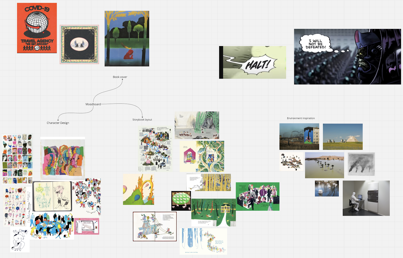
I began the process of this project by creating a mind map on miro board to
lay out all the ideas that I had.

|
|
Mind Map on Miro Board
|

|
|
The narrative
|
A raw concept of the narrative:
Giving the people
their realization or an understanding of things that goes over people's heads.
Sometimes or most of the time, when people dehumanizes others, people
dehumanizes themselves tooA cohesive narration that wraps around the entirety
of the subjects
A danger for democracy if we stop seeing critiques through cartoon or
photography.
To have the freedom of expression, freedom of media and political satire
To make people just to at least smile at it to understand the irony of the
subject and to make them feel interested or attracted

|
| Subjects/Ideas |
Splitting subjects into 4 parts; Environment, war, politics and
society.

|
|
Thought of a physical interactive display
|
An early idea of which a physical display will be in place for the
audience have the ability to interact with it.

|
|
Early considered typefaces
|

|
|
Working titles and sequences of the story
|
Working titles for the publication were:
A View from The Top
The Blue Pale Dot
An Imitation of Life
A Perfect World
I was at the point of not being able to decide on which direction I should go.
|
|
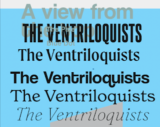
Deciding Typefaces
|

|
|
Undecided visual approach
|

|
|
Undecided visual approach
|
I then approached a direction that works well and I believe fits the
nature of the story.
I was able to delegate the necessary and
appropriate visual aesthetic that needs to be used for different parts of the
story.
For the clutter of words that was placed in each page/spread, I could
translate late those descriptive narration into visuals.
The typeface I finalized on choosing is called:
Oceanside Typewriter

|
|
Oceanside Typewriter
|
This typeface will be used for the both body copy and the title.
Sketch

|
|
'The Heirloom' Sketch
|
After

|
|
'The Heirloom' Illustration
|
Sketch

|
|
'Menagerie' Sketch
|
After

|
|
'Menagerie' Illustration
|
Refined Versions of previous drafts

|
|
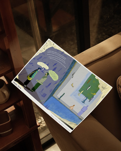
Refined Introduction of The Ventriloquists
|

|
|
Refined Part of the Ventriloquists
|
|
|
Posters - Collateral 4
|

|
|
Posters - Collateral 5
|

|
|
Posters - Collateral 6
|

|
|
Posters - Collateral 7
|

|
Posters - Collateral 8
|

|
|
Posters Overview
|

|
|
Stickers - Collateral 9
|

|
|
Stickers - Collateral 10
|
|
|
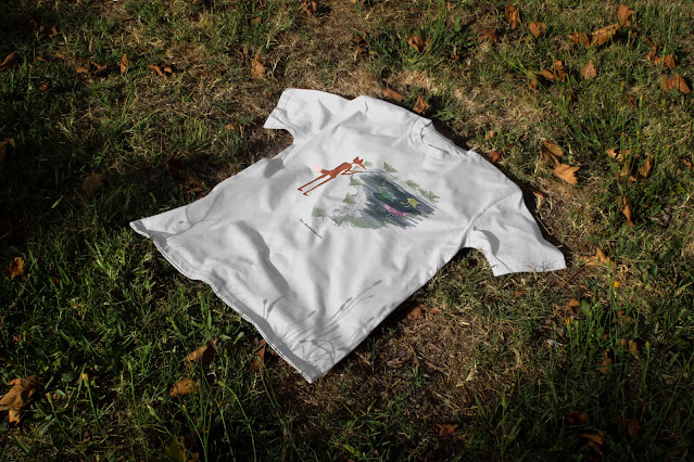
T-Shirt - Collateral 11
|

|
|
T-Shirt - Collateral 12
|

|
|
T-Shirt - Collateral 13
|

|
|
Visual Concept Book - The Ventriloquists: Entries &
Sketches, Collateral 14
|

|
Visual Concept Book - The Ventriloquists: Entries
& Sketches, Collateral 15
|
|

|
|
Visual Concept Book - The Ventriloquists: Entries &
Sketches, Overview 1
|

|
|
Visual Concept Book - The Ventriloquists: Entries &
Sketches, Overview 2
|
Final Presentation Deck
Human - The Ventriloquists
by Azriq Anwar
FEEDBACK
REFLECTION
Experience
This project proved that I pushed my limits as this is the most ambitious project that I have ever attempted. The intricacies of weaving together the ideas together was incredibly fulfilling and satisfying to say at most. But the challenge was balancing the body copies and the visuals. Nonetheless, I enjoy the whole process of everything in this project despite being struggles here and there. The skills that I gained from this project was knowing which necessary and appropriate visual aesthetic that needs to be applied for different parts of the story. Furthermore, translating the descriptive narration into visuals was a skill I gained from this project. This was the most fun and stressful projects that I've ever worked on.
Observations
The thing I struggled with the most was deciding on which kind of illustration style I should go with. The visuals at the start were underwhelming and the aesthetic I was trying to go for at first was not going on the direction I intended it to go. Even though I already planned and wrote the story, on paper it looked like that it would work but when it gets to the process of combining the narrative and the visuals together, it was too cluttered. The clutter of words were weighing heavier than the visuals. Moreover, the overall aesthetic of the whole project reached its target and purpose.
Findings
The things that worked well during the process were getting the right balance of chaosness, clear flow of storytelling from the start until the end of the publication, and also the the readability of everything. The illustration style worked well, way more than I expected. This might be the indecisiveness talking, but the outcome could have been slightly better in terms of the typeface for the titles that can be stylized and defined. Also, what I could have managed better was the persistency of my work. This knowledge that I gained will greatly influence future projects. As I go along, I will definitely pick up and explore more and experience more.
FURTHER READING |
| George Orwell's Animal Farm |
They believe that a life of equality and freedom will begin when the oppressed animals of Manor Farm defeat their master, Mr. Jones, and take control of the farm themselves. But over time, a crafty, vicious elite among them begins to seize power, and the animals are helplessly trapped as one type of tyranny gives way to another.


Comments
Post a Comment