Packaging And Merchandising Design - Project 2
05.10.2022 - 30.11.2022 (Week 8 - Week 14)
Azriq Anwar Bin Saprudin / 0353272
Packaging and Merchandising Design / Bachelor of Design (Hons) in Creative Media
Project 2
INSTRUCTIONS
The task is a collaboration between TDS students and food science students. We are supposed to work together to work on one big task, that is to have a collaboration with Kawan Food. We are working to design a packaging for Kawan Food.
Everyone in the class were assigned to designated groups. My group mates were Cecilia, Farah and myself. Our group name is called Mummy-Mia.
This is Cecilia's sketch and her experiment on trying to apply the design to the mockup.
This is Farah's sketch and her experiment on trying to apply the design to the mockup.
We changed the jackfruit window and removed the top bit of the jackfruit to make it have a smoother look. Around the window, we also added the saying 'Jackfruit Flavored Tater Tots' and on the right side of the window saying 'Sweet and Crunchy'.

We then had a presentation for Kawan Food and received some feedback on the packaging. Cecilia then worked on improving the logo of Jackries.
FINAL PROJECT 2 SLIDES SUBMISSION
FEEDBACK
Azriq Anwar Bin Saprudin / 0353272
Packaging and Merchandising Design / Bachelor of Design (Hons) in Creative Media
Project 2
INSTRUCTIONS
The task is a collaboration between TDS students and food science students. We are supposed to work together to work on one big task, that is to have a collaboration with Kawan Food. We are working to design a packaging for Kawan Food.
Everyone in the class were assigned to designated groups. My group mates were Cecilia, Farah and myself. Our group name is called Mummy-Mia.
We have to create the packaging for a frozen jackfruit product. We did an
online briefing with bioscience students about the chosen product before
we begin designing. They opted to prepare frozen tater-tots with
jackfruit. They provide the package design information so that we may go
on to our designs. Our goal is to modernise the packaging for "Kawan
Food," but we don't want to lose sight of the "Kawan Food" name so that
consumers can still recognise it. All ages should find the packaging to be
appealing and enjoyable. Younger people and possibly adults are drawn to
this product since it is fried food with good nutrients. When we figured
out the concept of our design, we worked more on the mood board.
We started drafting and experimented on how the packaging would roughly
look like.

|
| Fig 1.1 Azriq's (me) Sketch |

|
| Fig 1.2. Azriq's (me) Experiment |
This is Cecilia's sketch and her experiment on trying to apply the design to the mockup.

|
| Fig 1.3 Cecilia's Sketch |

|
| Fig 1.4 Cecilia's Experiment |
This is Farah's sketch and her experiment on trying to apply the design to the mockup.

|
| Fig 1.5 Farah's Sketch |
|
| Fig 1.6 Farah's Experiment |
After sending the sketches and experiments to the bioscience students, we
settled on my design. We then worked on that packaging and proceed to make
that design work as much as we can. After showing some progress to the
lecturer, he suggested to use either a box or a zipper pouch
packaging.

|
| Fig 1.7 Zipper Pouch Packaging Mock Up |
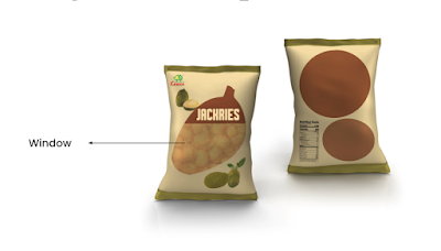
We changed the jackfruit window and removed the top bit of the jackfruit to make it have a smoother look. Around the window, we also added the saying 'Jackfruit Flavored Tater Tots' and on the right side of the window saying 'Sweet and Crunchy'.
We then made another mock-up of a box packaging, while having the same
design on the zipper packaging. Reason of doing a mock-up for a box version
is to have more fluidity on shelving of the product.

|
| Fig 1.8 Box Packaging Version |
After some feedback, we changed the color of the logo into a darker
shade of orange ish yellow to have more contrast.

|
| Fig 1.9 Box Version before feedback |
We then had a presentation for Kawan Food and received some feedback on the packaging. Cecilia then worked on improving the logo of Jackries.

|
|
Fig 1.10 Final Design |
FINAL PROJECT 2 SLIDES SUBMISSION
FEEDBACK
Week 9
- make the concept of the packaging more fluid.
- establish a target audience as the proposed design is aimed to younger audience and it doesn't suit Kawan Food as it is not part of the brand indentity.
Week 10
- good design but window is too big.
- the jackfruit can be placed more randomly.
Week 11
- window is still too big, resize it a bit.
- make the color have more contrast so the product stands out.
- make the kawan food logo bigger.


Comments
Post a Comment