Publishing Design - Task 1: Exercises
01/09/23 - 20/10/23 / Week 1 - Week 8
Azriq Anwar Bin Saprudin /
0353272
Publishing Design / Bachelor of Design (Hons) in Creative
Media
Task 1: Exercises
LECTURES
Week 1 - Lecture 1, Formats
The Book
One of the most significant and influential formats is the book, as most
significant publications focus on them. A book is used as a medium to record
and disseminate knowledge, ideas, records, history, and other things. A
thorough knowledge of typography, a good sense of space, an attention to
detail, and proficiency with publishing technologies are required for book
design. It is crucial to consider the readership of the work. Using
Illustrator to design a book is useless.
Historical Formats
Technology is generally always followed by innovation. Technology
advancements open up new opportunities.
1. Mesopotamia
The earliest writing system was created in Mesopotamia using counting
techniques. Early pictographic writing on clay tablets was made
possible by the transition from basic & complicated tokens to the
bullae.
2. Indus River Valley
Although there are not many historical documents from the Indus
River Valley Civilizations, it is known that they possessed a
sophisticated system. One of the first writing systems was used by
them and was called cuneiform. Sharp, pointed writing implements
were used to inscribe them on soft clay tablets. Their archives
included themes including trade, governance, and religion. The
800-900 CE period in Nepal is when the earliest palm leaf manuscript
that has survived was created.
It is believed that the Indus Valley has been using palm manuscripts
from 1000 BCE.
3. Egypt
Only scribes in Egypt were able to read and write hieroglyphics.
In addition to writing on the tomb walls, scribes also used
papyrus, a particular kind of paper manufactured from the pith of
the papyrus plant.
4. Han-China
Vertical columns were used to write Chinese characters in the
early times. This meant that for one column, a thin strip of
bamboo would be suitable. Bamboo strips were joined by two lines
of thread to create a larger document. Chinese manuscripts from
the T'ang Dynasty are the oldest books to have been printed. In
1899, it was found in a cave near Dunhuang. Paper was utilised,
and it was arranged in a scroll. Wood block printing is a
time-consuming procedure. Confucian classics as well as a wide
range of Buddist and Taoist texts were produced for the use of
scholars and officials in the 10th and 11th centuries. Although
realised in Korea, the invention of carving on wood blocks
backwards appears to have originated in China.
5. Turkey and The West
Turkey (c. 197–159 BC) is where parchment was first created.
It was too heavy to be fashioned into scrolls and is composed
of animal skin. Paper would go west at a leisurely pace.
Between 1400 and 1500 CE, paper became commonly available in
Europe. At the turn of the century, the folding format gained
significant traction in the west. Wooden blocks were first
joined together with thread, then with plaster, and finally
with paper that had been bound, stitched, and bonded.
Week 2 - Lecture 2, History of Print
2nd - 8th Century AD
The six great Confucian classics are ordered to be etched into stone by the
Chinese Emperor in AD 175. The Confucian intellectuals laid paper on the
engraved slabs and rubbed it with charcoal or graphite because they were
anxious to acquire the valuable writings.
Korea and Japan: AD 750 - 768
One impressive accomplishment of East Asian Buddhists is the development of
printing. A sutra that was written on a single sheet of paper in Korea in AD
750 is the oldest known printed document.
The empress of Buddhist Nara ordered a large fortunate charm or prayer in AD
768. Million copies were produced for distribution to pilgrims, and the
project is said to have taken six years to complete.
One notable woodblock print is called the Hyakumant Darani. These documents
date back to ancient Japan.
Movable type: 11th century
Before printing became a useful tool for disseminating information, movable
type (separated ready-made characters/letters that could be placed in the
right sequence for a given text and then reused) was a crucial step. In
China, the idea was tested as early as the 11th century. Chinese script
featured an excessive number of characters, which made typecasting and type
setup difficult. Another is that Chinese printers make their characters out
of clay, fire them, and turn them into pottery, which makes them too
delicate for the job.
Type foundry in Korea: c.1380
Koreans created a foundry to manufacture bronze moveable type in the late
14th century. Bronze is a sturdy material that can be broken down and
reset for fresh text after several printings. The Koreans faced a
character count issue since they were still using Chinese writing at the
time. This was resolved in 1443 when they created their own alphabet,
known as ashan'gul.
Saints and Playing Cards: AD c.1400
Europe first adopted the practice of printing using wood blocks around
1400. Similar to how they were printed in the east, the pictures were
created by simply setting a piece of paper on a block that had been
carved and inked, then rubbing the paper to transfer the ink. Similar to
the east, pilgrims can buy sacred icons in the main bazaar. Another
early component of the western commerce is playing cards.
Western printing and Gutenberg: 1439–1457 AD
In a Strasbourg court case from 1439, the name of Gutenberg first
occurs in relation with printing. Nothing from this era has remained,
although it was Gutenberg who is credited with being able to print
little passages of text using moveable type, as is now done in
Strasburg. The next time Gutenberg is mentioned in connection with
printing is in 1450, Maine, when he secured a loan from Johann Fust
for 800 guilders using his printing press as collateral.
One of Gutenberg's innovations was the printing press's ability to
deliver a quick and consistent downward pressure. Due to his
metalworking expertise, Gutenberg was able to master the intricate
steps involved in producing individual pieces of type, including
making a master copy of each letter, building the molds used to
produce many copies, and generating a suitable alloy (type metal) to
cast the letters in. This clever technique comes before the
fundamental task of printing, which is to align and spacing the
individual letters in a way that will hold them firmly and level and
transfer the ink to the paper evenly.
There are no dates in the Bible printed by Gutenberg. In the
middle of the 1450s, it was produced concurrently on six presses.
On August 24, 1456, at least one copy is known to have been
finished, with the initials hand-colored red.
Week 3 - Lecture 3, Typography Redux
Typography
Typography is like air to a graphic designer. In order to hold ourselves
to high standards, it is the most crucial aspect of graphic design to
grasp. It is the skill of organising and writing text. Additionally, it
is a means of expression and, most crucially, of communication. It has a
major impact on design work. Our knowledge and intuition gained over the
last two semesters will be very important in the book design
process.
Characters in a typeface
- Small caps
- Numerals
- Fractions
- Ligatures
- Punctuations
- Mathematical signs
- Symbols
- Non-aligning figures

|
| Fig 1.1 Characters in a typeface |
It is crucial to follow established legibility rules in order to
make sure that a body of text can be read. A designer must be
entirely knowledgeable of these rules in order to break them. It
is necessary to select fonts that are open and well proportioned
in order to make text legible.
There were several new typesetting features available with
computers. The reader is harmed by these violations since
individuals weren't aware of the typographic requirements, which
was an issue. Certain factors must be taken into account in
order to guarantee that the type is readable.
- Underline: Many programs improperly underline because it should be decreased to avoid touching the characters since it impairs reading. There are two different kinds of underlines: one that emphasizes each individual word and another that emphasizes the entire phrase.
- Small capitals and all caps: The first line of a paragraph's subheadings should be written in small capitals. Short headlines or subheads should only include text that is set in all caps. It should be noted that using all caps for emphasis or extended phrases is not permitted. It was intended that capital letters be punctuated rather than used carelessly.
- Special-Purpose Style: Software programs offer a variety of formatting options for creating footnotes, references, and mathematical calculations. A typical user may not be aware of them since they are typically layered or embedded inside the tools sections.
- Text Scaling: By extending or condensing a typeface either horizontally or vertically, certain applications enable the development of a pseudo-condensed or pseudo-extended font. The font's original design is distorted by this, making it appear cheap.
- Another technique that frequently gets misused is outline and shadow. To format writing attractively and properly, one needs a lot of practice. It shouldn't go beyond 1 point for the outline. Keep in mind that shadows shouldn't detract too much from the primary text.
When the connection between the type sizes, line lengths, and
gaps between the lines of type is harmonic, the text reads
smoothly. Legibility issues are completely subjective and can
even damage fonts that are professionally designed. A type
column typically has 50 characters and shouldn't exceed 65. If
not, the text would be packed and difficult to read.
The amount of space between type lines is referred to as leading
or line spacing. Similar to text size, there are no established
guidelines for line spacing. But there are a few things to think
about:
- Using this font: To prevent their ascenders and descenders from contacting one another, some require more line spacing than others.
- The following line: For easy reading, longer lines need extra leading.
- The font size is: Line spacing needs to be increased as font size increases. This guideline mostly applies to body material, while headings, which are often written with wider spacing, may also be set with closer spacing.
Extra care may be required depending on the application
being used to prepare the text. To prevent widows and
orphans, the spacing between letters and paragraphs must be
modified for larger font sizes.
Inter-character spacing, or kerning, gives the text a more
aesthetically attractive appearance. The majority of
page-layout applications apply kerning automatically, but
the majority of word processors do not offer kerning
modifications. However, certain letter combinations can
require manual alterations.
Tracking: This term, which is related to kerning,
describes the adjusting of a number of letters, words, and
spaces. The basic goal is to fit type into a space while
maintaining type size and line spacing that are appropriate. It
could be detrimental or beneficial. Fixing individual words or
the conclusion of a paragraph is a significant usage.
The typeface selected, as well as word spacing, can help
establish proper word spacing. An even typographic "colour" is
created by consistent spacing.
Italics: Should only be employed sparingly. Reading is
hampered by text that is heavily slanted. Instead than serving
as text, it works best when used to emphasize text.
Capital letters take up more room and make reading more
difficult. It is visually monotonous.
Week 4 - Lecture 4, The Grid
Raster System
The application of grids as organising systems is a
manifestation of a particular way of thinking that shows how a
designer generates their work in a productive way. A
two-dimensional plane is divided into smaller fields, and a
three-dimensional space is divided into smaller compartments
by the grid. The sizes of the compartments may be the same or
different.
The Purpose of the Grid
The grid that designers employ can resolve issues with vision.
A designer can strategically position text, images, and
diagrams in a logical and useful way by organising surface and
spaces into a grid. This produces a feeling of clarity,
comprehensibility, and compact planning. In terms of design
practise, it also implies orderliness.
Modular
Although modular in nature, the grid should not be used as a
restriction. It does permit flexibility that is, provided
the designer can see a wide range of possible
configurations. To preserve some continuity or
coherence in its view and navigation, a boundary must be
established. Since each book's contents might have a
distinct range, a lot of this depends on what's in it. A
grid makes it possible to organise the data such that it is
simple to read and comprehend.
Week 5 - Lecture 5, Elements
Every publication is made up of three main components:
1. Type
2. Colour
3. Image
Variation
While incorporating variance into the layout, a designer
should keep the book's overall style consistent. This
means introducing diversity in the arrangement and mix
of parts, but leaving some sections permanent, such as
the hang line, typography, colour, and picture
styles.
INSTRUCTIONS
Exercise 1: Text Formatting
We were tasked to write 3000 words of a topic of our choosing.
Fig 2.1 Draft, Somewhere In The Lost And Found
Materials were required for this exercise. We prepared A3 paper, large rubber
band and stapler, adhesive tape, steel ruler, cutter, pencils, pens and
markers.
We had to explore 3 different sizes that had to be between A4 and A5.
The sizes that I tried:
150mm x 265mm
183mm x 229 mm
194mm x 255mm

|
| Fig 3.1 Book Size Exploration |
I chose the 194mm x 255mm as I thought the size was the size that looked best
out of the other 2 options. I proceeded to bind 16 sheets of A3 paper together
with a stapler. Then I measured the length of my chosen size and cut the A3
paper into that size.

|
| Fig 3.2 Final Book Mockup |

|
| Fig 3.3 Interior Book Mockup |

|
| Fig 3.4 Stapler Binding |

|
| Fig 3.5 Book Size Exploration and Final Book Mockup |
Exercise 3: Signature Folding Systems (8+8=16)

|
| Fig 4.1 Signature Folding System (Open) |

|
| Fig 4.2 Signature Folding System (Binded) |
Exercise 4: Van de Graaf

|
| Fig 5.1 Van de Graaf |
Fig 5.2 Zine layout print

Fig 5.3 Zine Printing (Binded)
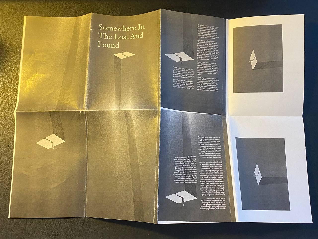
Fig 5.4 Zine Printing (Open 1)

|
| Fig 5.5 Zine Printing (Open 2) |
Exercise 5: Determining Grids
Fig 6.1 Determining Grids
FINAL SUBMISSIONS
Exercise 1: Text Formatting
Fig 7.1 Text Formatting, PDF
Exercise 2: Mock-up Making
Final Book Size: 194mm x 255mm
|
|
| Fig 8.1 Book Size Exploration |
|
|
||
Fig 8.2 Interior Book Mockup
|
Exercise 3: Signature Folding Systems (8+8=16)
|
|
| Fig 9.1 Signature Folding System (Open) |
|
|
|
Fig 9.2 Signature Folding System (Binded) |
Exercise 4: Van de Graaf
|
|
| Fig 10.1 Van de Graaf |
Fig 10.2 Zine layout print
Exercise 5: Determining Grid
Fig 11.1 Determining Grids
Type Specimen Sheet
Typeface: Karrik
Font size:
- Cover Page title and author: 20pt, 16pt
- Half title: 15pt
- Full title: 17pt
- Heading: 18pt
- Subtext and pullquote: 13pt
- Body text 9pt
Leading: 12pt
FEEDBACK
Week 2
Specific feedback: To have 3 subtexts for each section.
Week 4
Do not use a condensed font for the body text as it is hard to read.
REFLECTION
Experience
Experiencing the exercises that were conducted in this task was very interesting and fun. Always wondered how books are made and felt excited to finally understand the process.
Observation
Throughout this module, I looked and seen so many book layouts for references. I had a hard time on choosing the preferable layout and font but it worked out in the end.
Findings
Gaining what I've learned from this task, it broaden my knowledge on publishing in general.
FURTHER READING
 |
| Fig 12.1 Judging a Book by Its Cover: The Art of Designing a Book |
The Swiss typographer and author Jost Hochuli developed fourteen criteria in the 1990s for evaluating a book. These criteria included matching the font to the content, assessing the proportions between the text and the illustrations, evaluating the printing process and the type of paper used, and even highlighting the “correct orientation of the fibre in the main body and the endpaper,” which highlighted the book's integral nature and functionality.
"We should remember that, unlike commercials or posters, the existence of a book is stretched over time, and we judge the cover at least twice: in the bookstore and after reading, and these are two different perspectives." as quoted by the author, Kuba Sowiński.


Comments
Post a Comment