2705/24 - 26/07/24 / Week 6 - Week 14
Azriq Anwar Bin Saprudin /
0353272
Creative Brand Strategy / Bachelor of Design (Hons) in Creative
Media
Task 3 - Campaign Branding
INSTRUCTIONS
Task 3 - Campaign Branding
After coming up with the ideation and design direction in Task 2A and 2B, now
its the process of execution the visual identity and apply the designs onto
applications, eventually placing them onto a presentation deck.
Campaign Name
Crunch Off Guilts
Tagline
Snack without apology!
Key Message
Experience guilt-free indulgence with the perfect collaboration between Pocky
and Calli ice cream, where delicious treats meet wholesome ingredients for a
healthier snacking experience.
With a focus on using natural sweeteners, avoiding artificial preservatives,
and crafting snacks that leave you feeling satisfied and energized, Pocky x
Calli offers a guilt-free alternative to traditional indulgences.
Join us in redefining snacking by enjoying the irresistible taste of Pocky's
biscuit sticks paired with Calli's creamy ice cream, creating a match made in
snack heaven that prioritizes health and promotes guilt-free enjoyment.
Voice/Personality
Crunch Off Guilts gives an upbeat, positive, and playful energy that is
engaging and infectious. With a youthful enthusiasm, it speaks in a friendly,
encouraging, and motivating tone that inspires people to make healthier snack
choices. The language is natural and conversational, with a touch of humor and
wit that makes the audience feel like they're chatting with a peer on the same
journey to be healthier.
Underneath the fun and playfulness, the voice also conveys a sense of
expertise and trustworthiness. It provides helpful information about nutrition
and wellness in an easy to understand way, so the audience can feel confident
that the advice and recommendations are sound. The voice comes across as
relatable and authentic, never preaching or lecturing, but rather speaking to
the audience as a knowledgeable friend who is there to support and motivate
them every step of the way.
Typefaces
Heading: Rigero Regular
Body copy: Arial Rounded MT Bold
Sub-heading (exception on packaging): Nicky Regular
 |
| Fig 1.1 Typefaces used, Rigero Regular, Arial Rounded MT Bold & Nicky Regular |
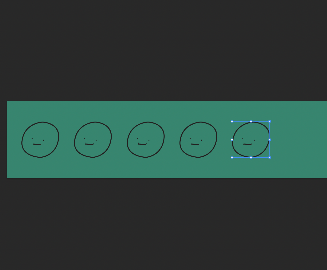
Graphic Elements
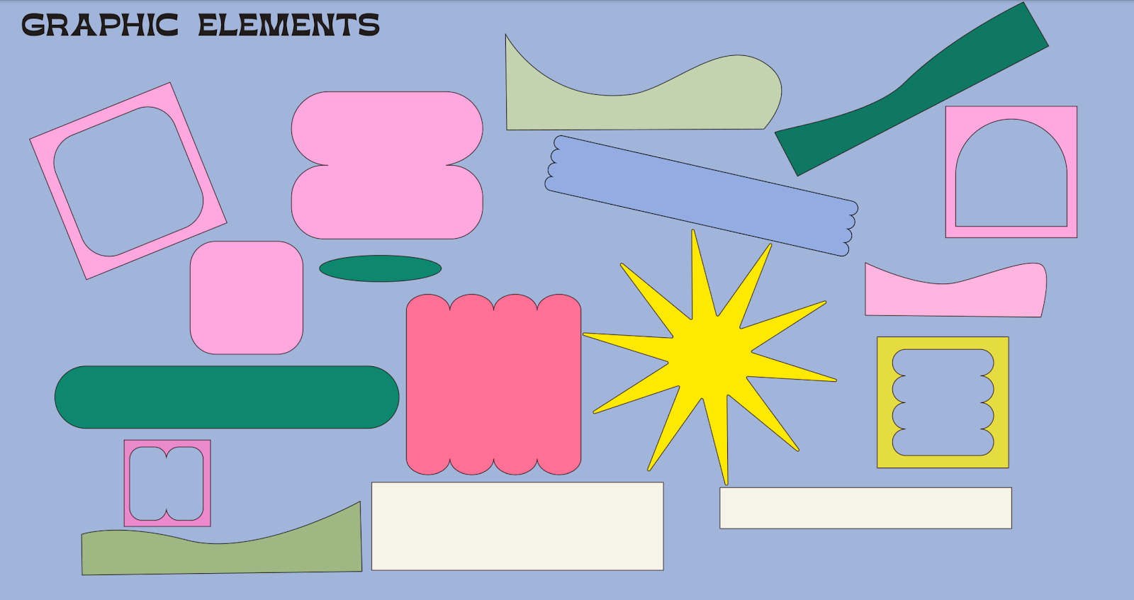 |
| Fig 1.2 Graphic elements |
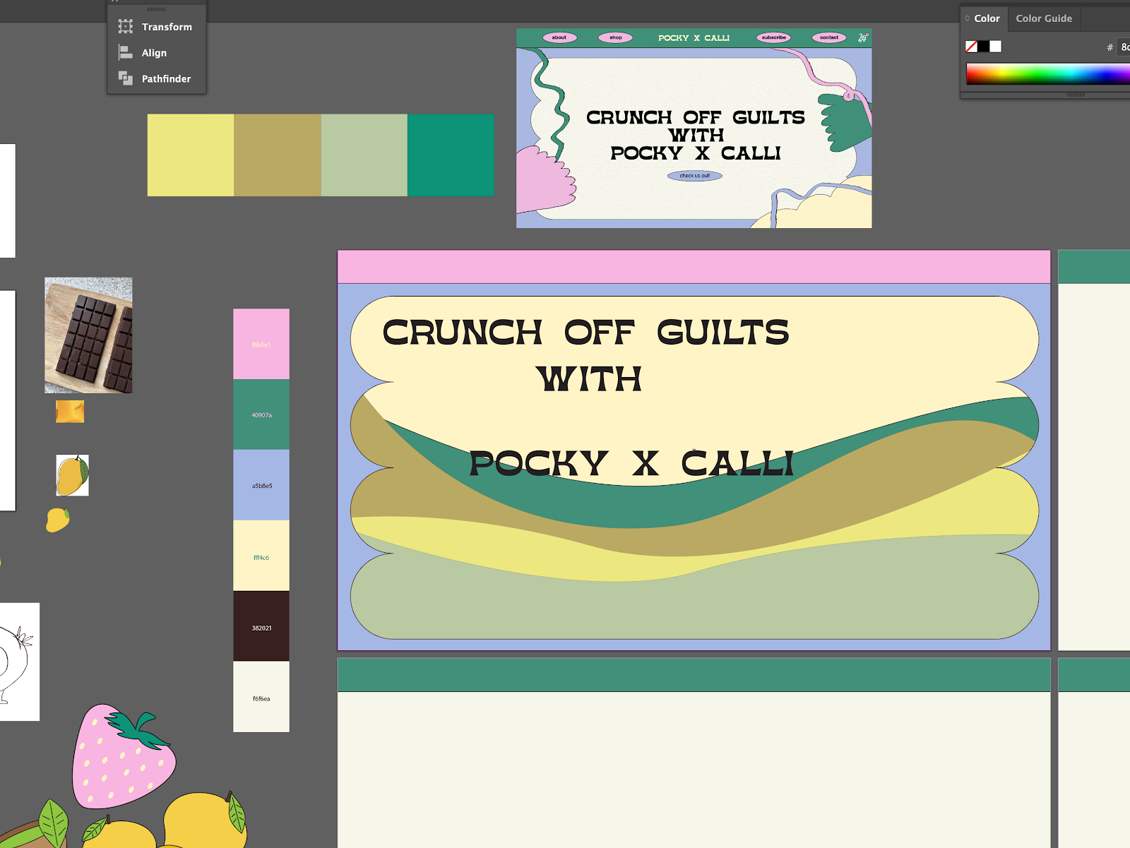
Color Palette
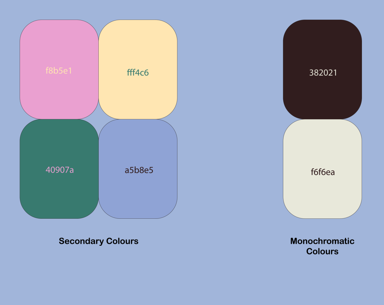 |
| Fig 1.3 Color palette |
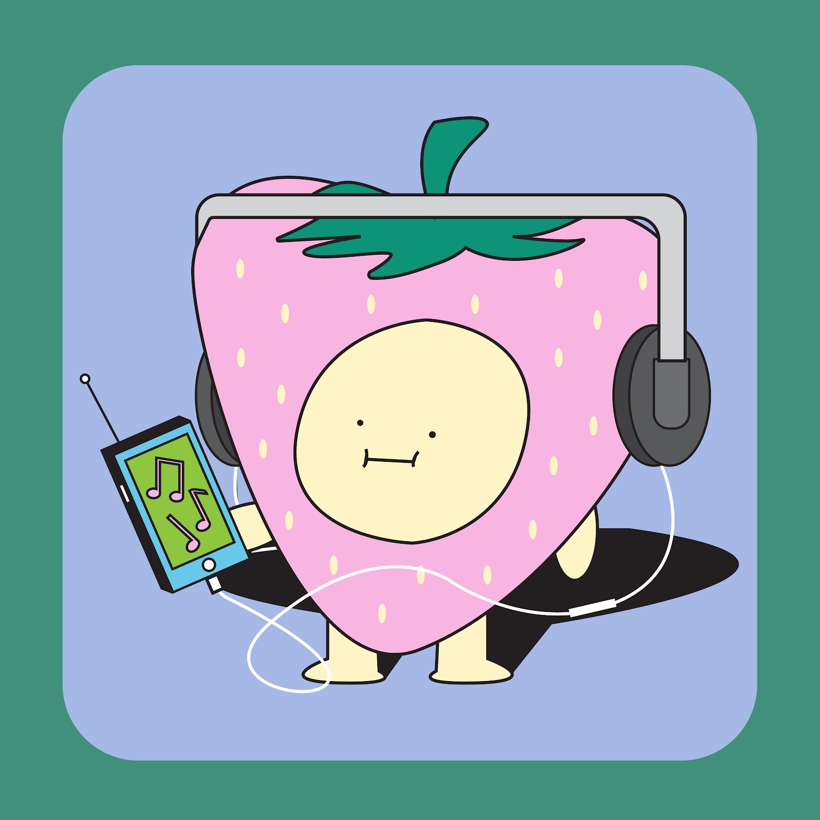
Illustrations
 |
| Fig 1.4 Illustrations |
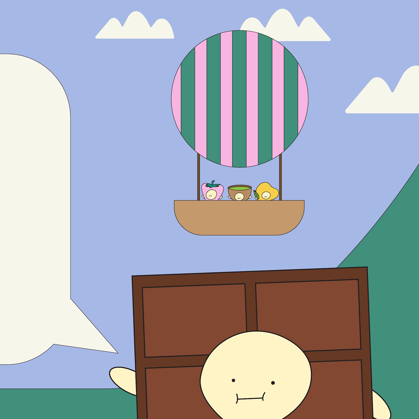
Online Touchpoints
Social Media
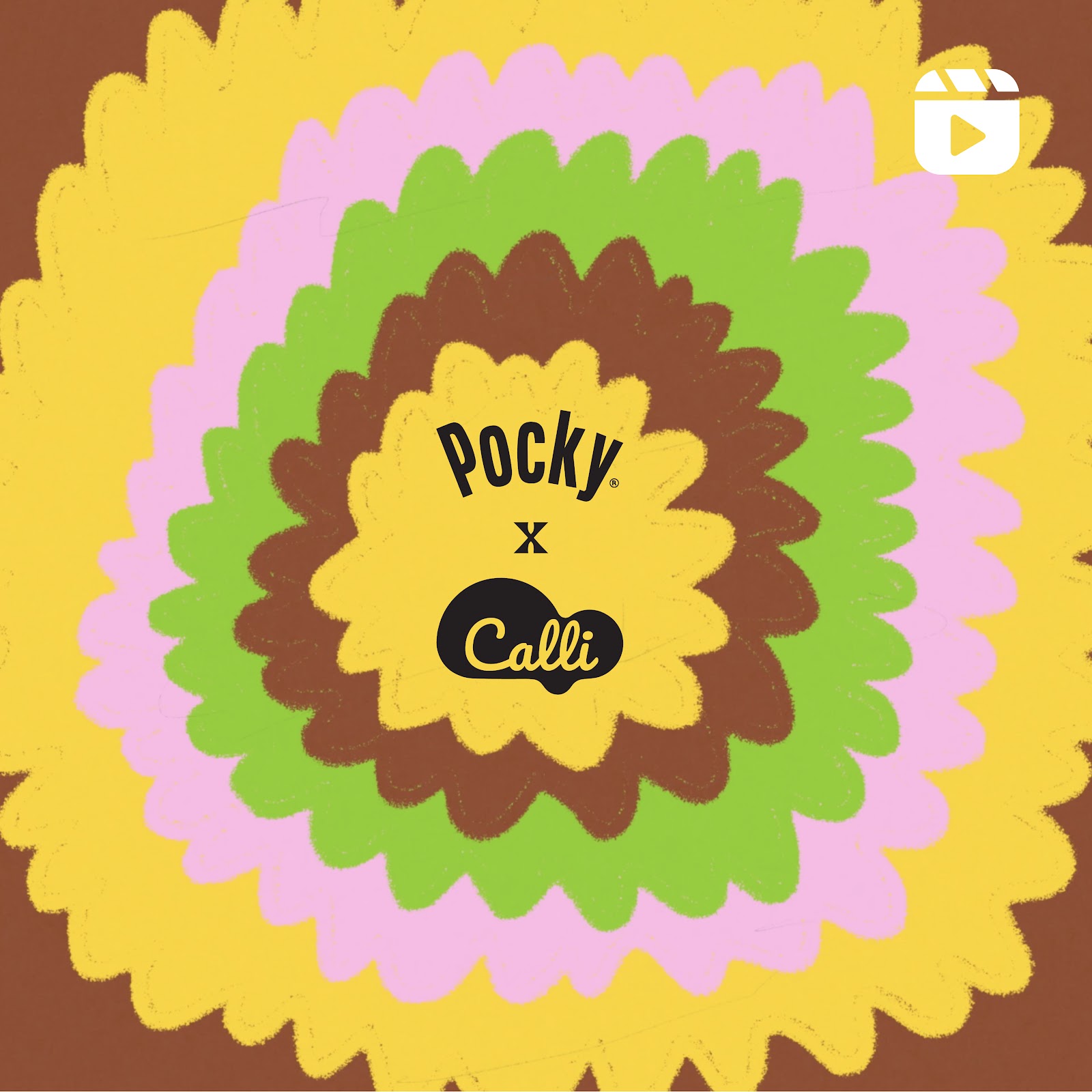
Post 1
 |
| Fig 2.1 Introduction post to campaign |
Post 2
 |
| Fig 2.2 Visual reveal of collaboration |
Post 3
 |
| Fig 2.3.1 Flavours reveal |
 |
| Fig 2.3.2 Flavour 1 'Strawberry Fields' |
 |
| Fig 2.3.3 Flavour 2 'So Matcha Better' |
 |
| Fig 2.3.4 Flavour 3 'Cocoachella' |
 |
| Fig 2.3.5 Flavour 4 'Mango Van Gogh' |
Post 4
 |
| 2.4.1 Campaign tagline introduction 1 |
 |
| 2.4.2 Campaign tagline introduction 2 |
 |
| 2.4.3 Campaign tagline introduction 3 |
Post 5
 |
| 2.5 Promotional video of the campaign |
Post 6
 |
| 2.6 Announcement of custom made music playlist |
Post 7
 |
| 2.7.1 Merch announcement 1 |
 |
| 2.7.2 Merch announcement 2 |
 |
| 2.7.3 Merch announcement 3 |
 |
| 2.7.4 Merch announcement 4 |
 |
| 2.7.5 Merch announcement 5 |
Post 8
 |
| 2.8 Promoting health in the snack product |
Post 9
 |
2.9 Subscription promotion
|
Mockup
 |
| 2.10 Social media mockup |
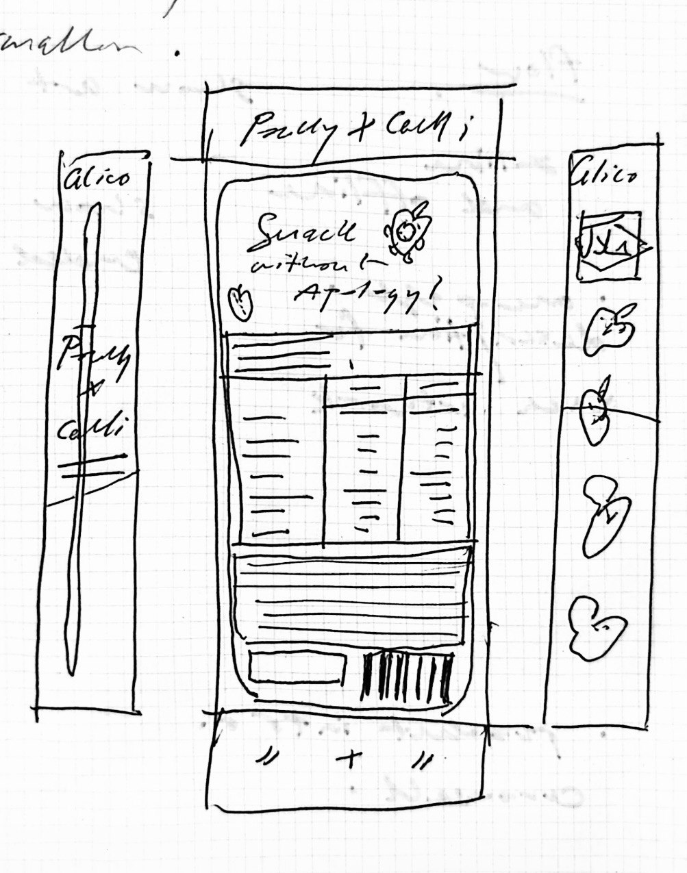
Website
Landing Page
 |
| 2.11 Website page 1, Landing Page |
About Page
 |
| 2.12 Website page 2, About Page |
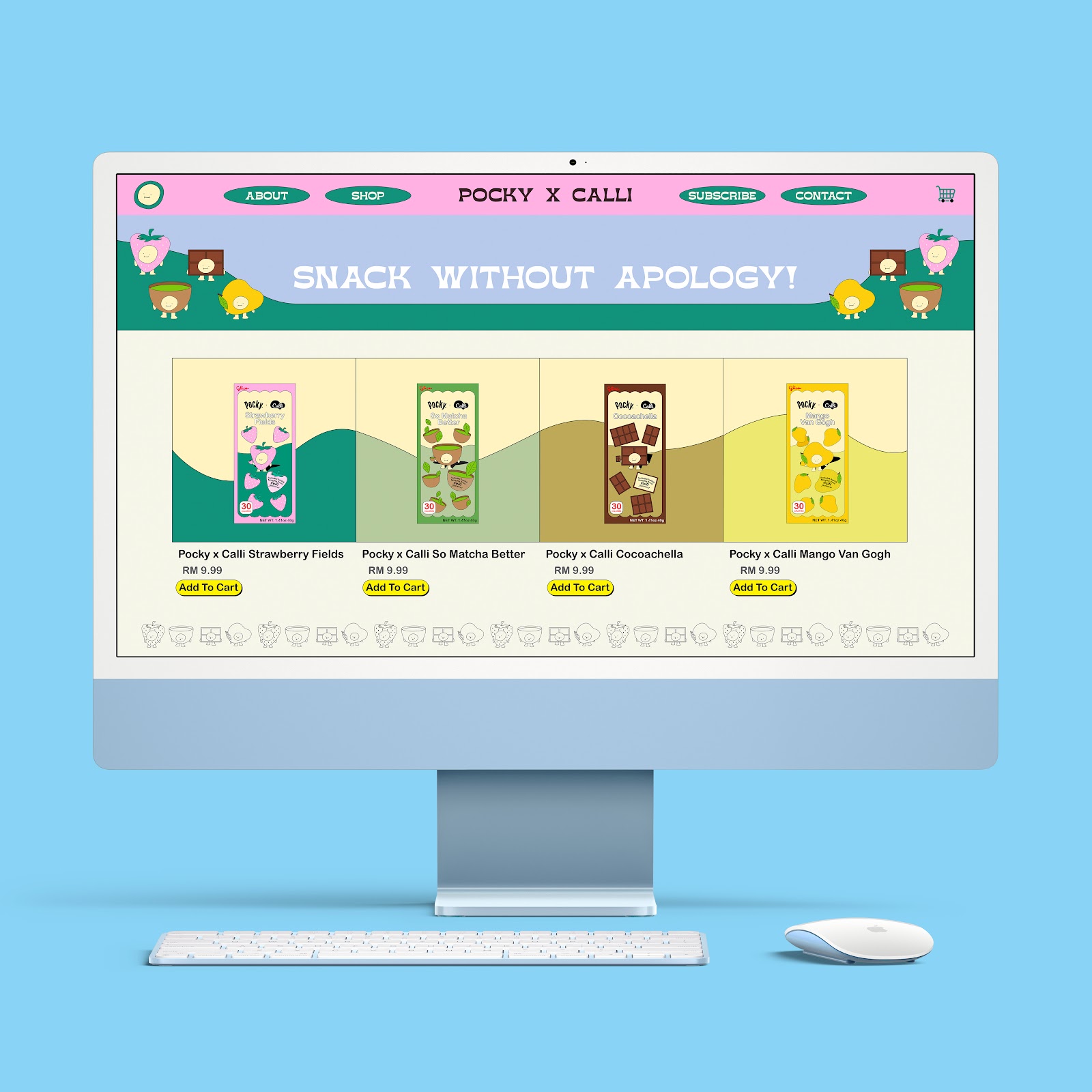
Shop Page
 |
| 2.13 Website page 3, Shop Page |
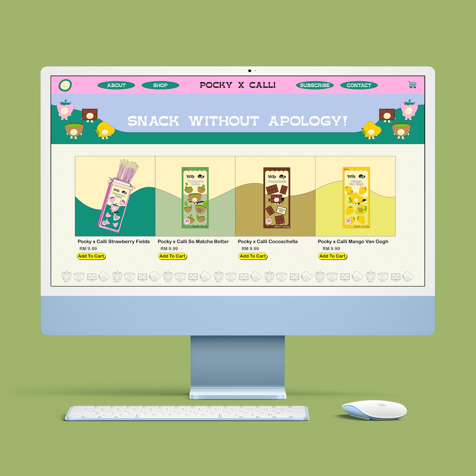
Shop Page #2
 |
| 2.14 Website page 4, Shop Page #2 |
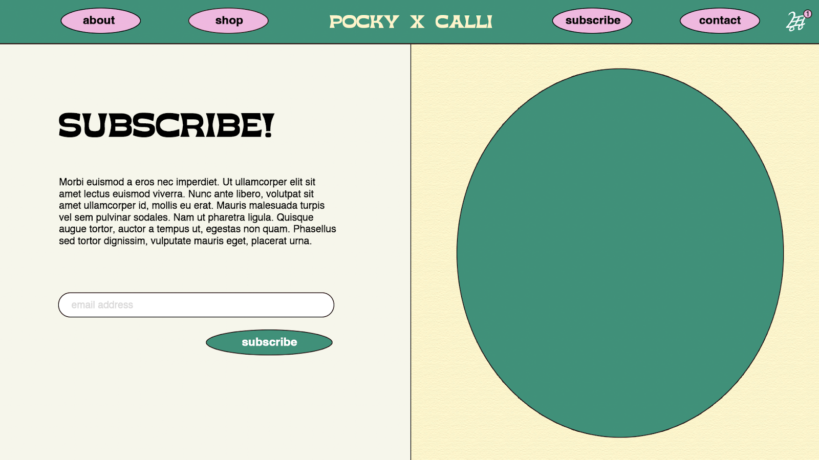
Subscription Page
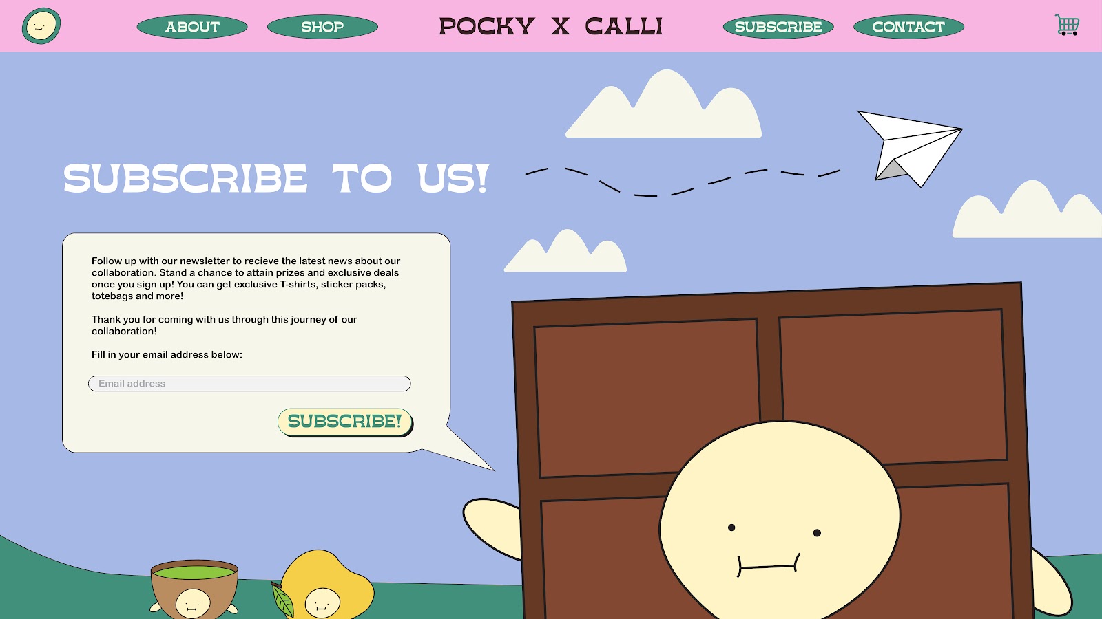 |
| 2.15 Website page 5, Subscription Page |
Contact Page
 |
| 2.16 Website page 6, Contact Page |
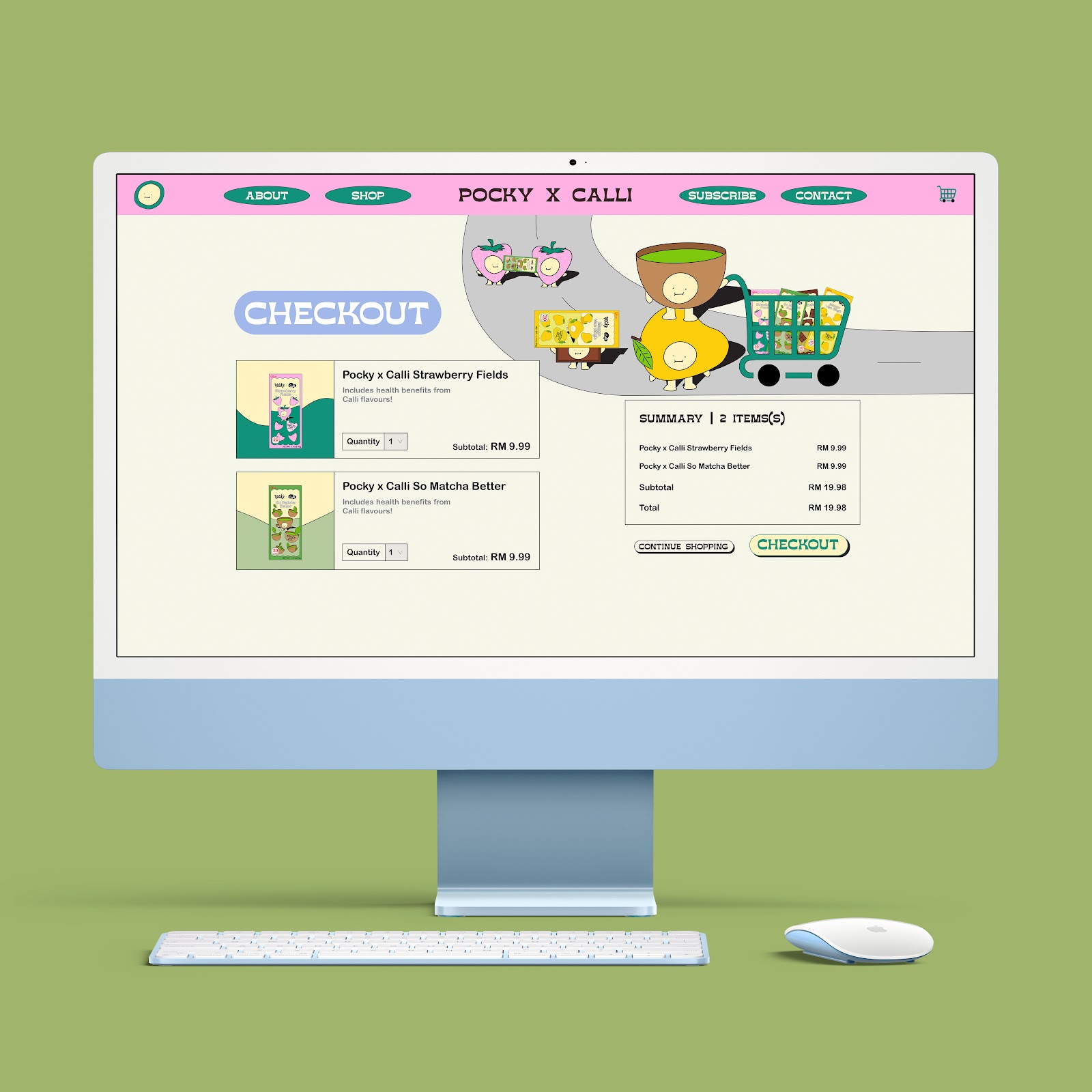
Checkout Page
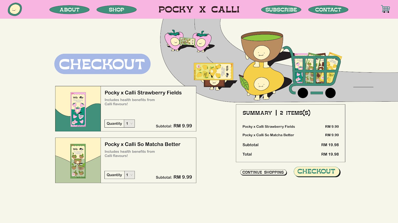 |
| 2.17 Website page 7, Checkout Page |
Mockup |
| 2.18.1 Website mockup 1 |
 |
| 2.18.2 Website mockup 2 |
 |
| 2.18.3 Website mockup 3 |
 |
| 2.18.4 Website mockup 4 |
 |
| 2.18.5 Website mockup 5 |
 |
| 2.18.6 Website mockup 6 |
 |
| 2.18.7 Website mockup 7 |
Spotify Playlist
 |
| 2.19 Spotify playlist Cover Art |
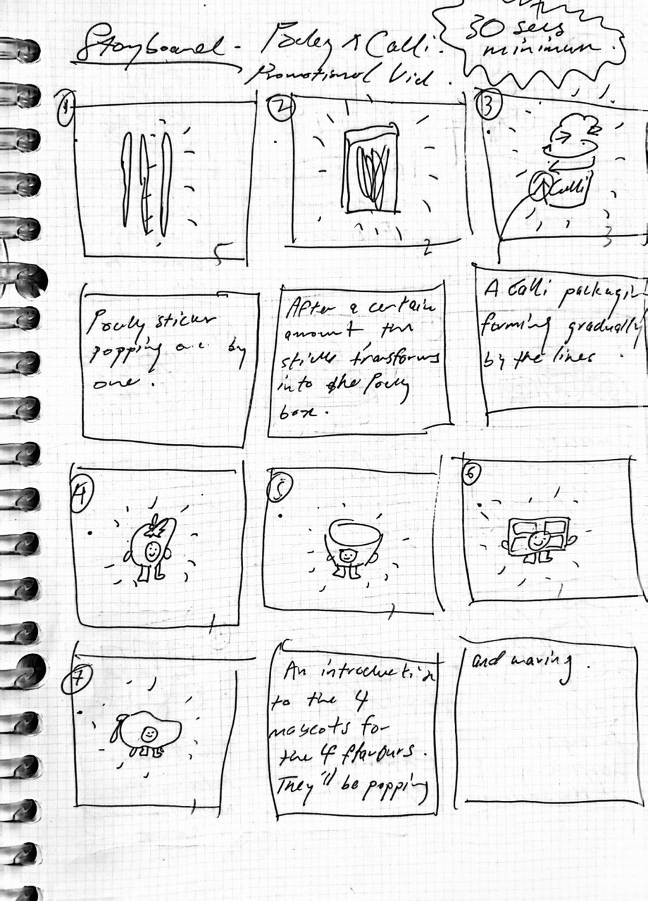
Promotional Video
 |
| 2.20 Timeline of promotional video |
2.21 Crunch Off Guilts promotional video
Link to video
Offline Touchpoints
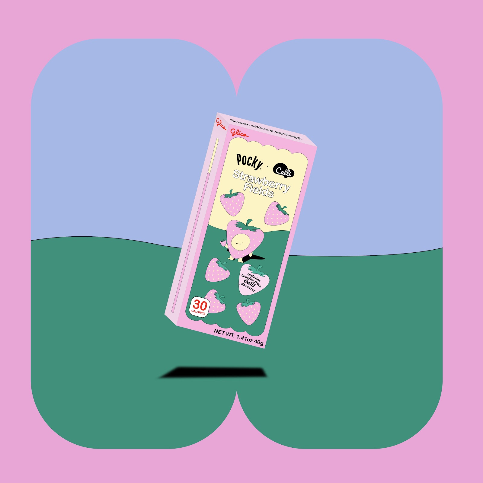
Packaging
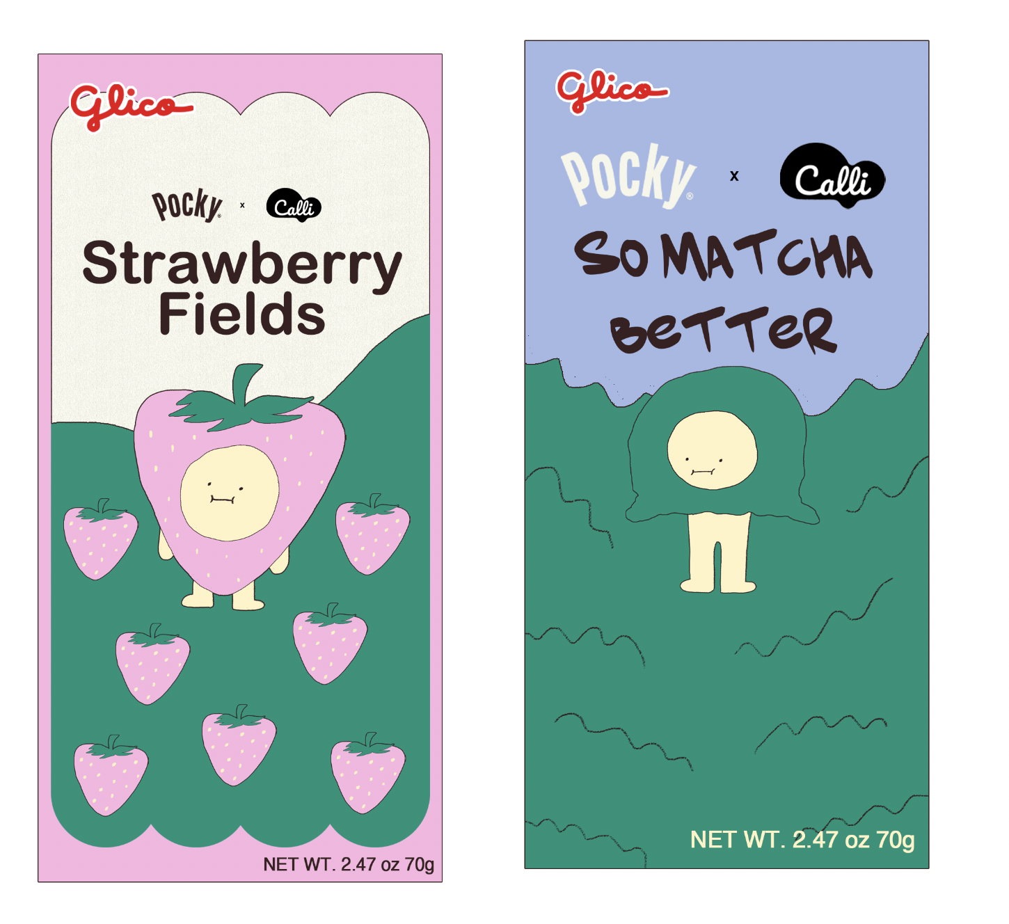
'Strawberry Fields'
 |
| 3.1 Packaging 1, 'Strawberry Fields' |
'So Matcha Better'
 |
| 3.2 Packaging 2, 'So Matcha Better' |
'Cocoachella'
 |
| 3.3 Packaging 3, 'Cocoachella' |
'Mango Van Gogh'
 |
| 3.4 Packaging 4, 'Mango Van Gogh' |
Store Display
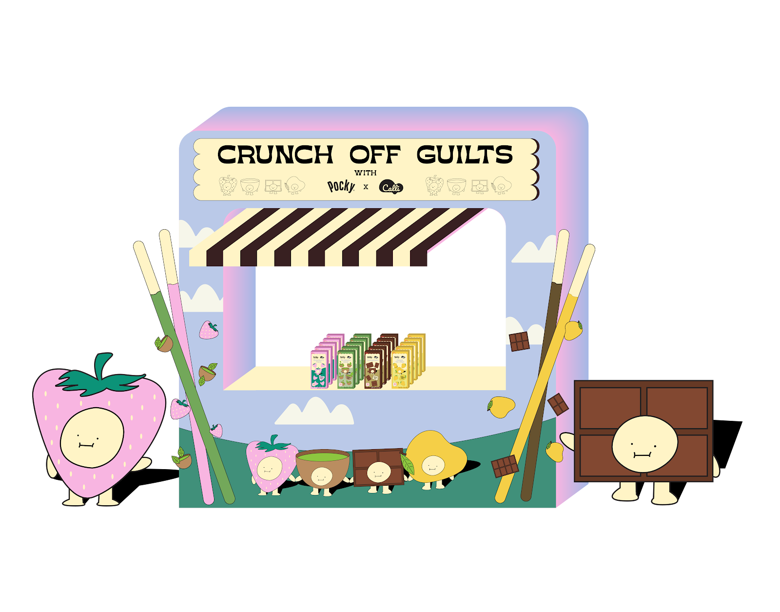 |
| 3.5 Store display |
Merchandise
 |
| 3.6 Merchandise 1, T-Shirt |
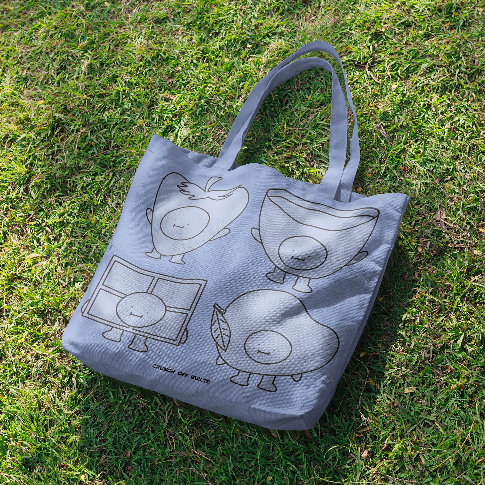 |
| 3.7 Merchandise 2, Totebag |
 |
| 3.8 Merchandise 3, Bucket Hat |
Environmental Graphics/Posters
 |
| 3.9 Campaign promo on billboard |
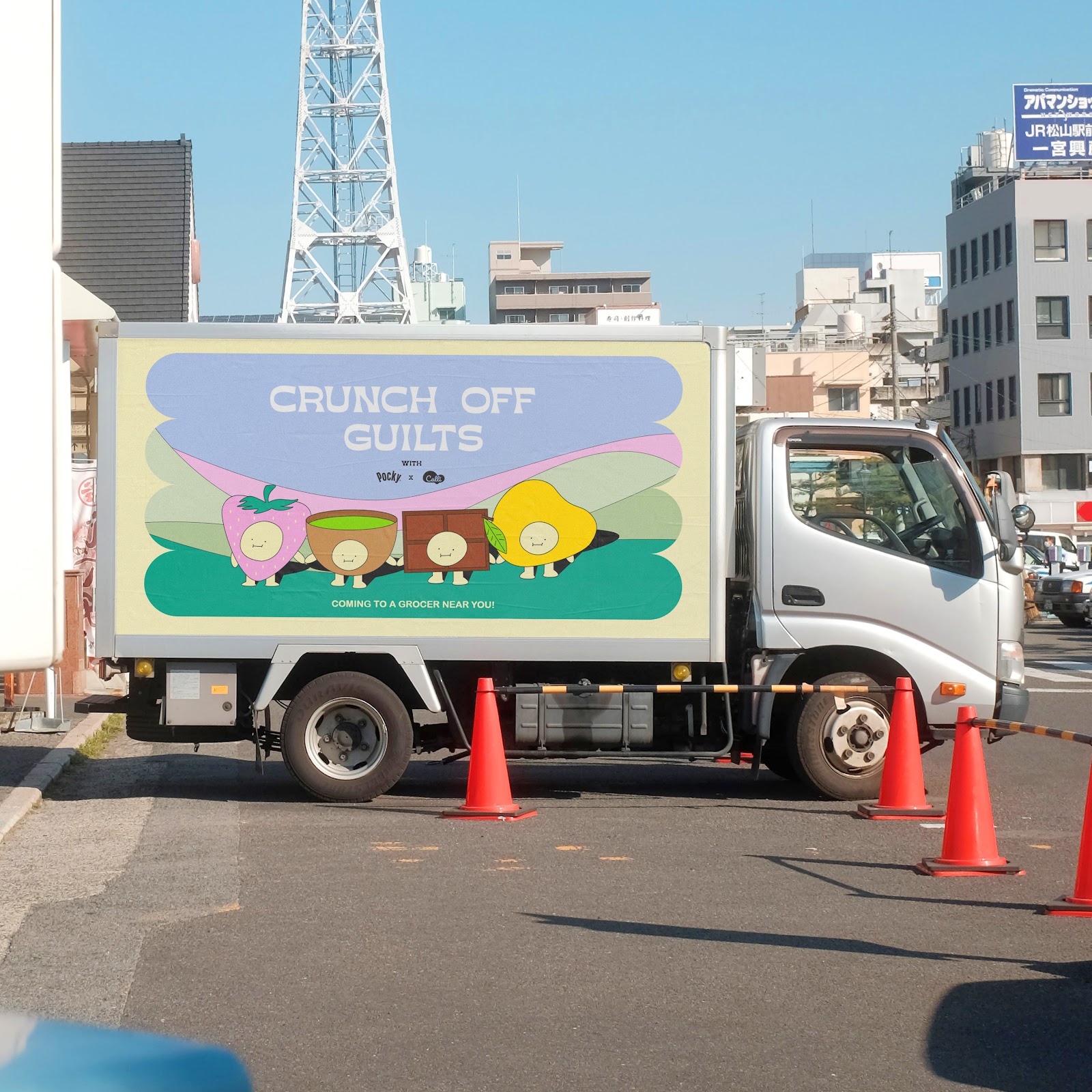 |
| 3.10 Campaign promo on lorry |
Final Task 3 Submission
4.1 Final Task 3 Submission
FEEDBACK
Week 11
Lose some outlines for the framing of the designs to make the main illustrations and environment much more noticeable and clearer. Also remove the Pocky sticks from the packaging itself and focus more on the illustrations. Furthermore, readjust the sizing of the logos that are featured on the packaging. Moreover, fix the typeface for the headings on the website and readjust some elements in some of the webpages.
REFLECTION
Sketching out the ideas for this task was fun and exciting because of the ideation and design direction that was established during Task 2A & 2B. But when it came to the executing part was when it became challenging. It was tough to figure out the exact aesthetic that I was going for but eventually I did. I think I would have done more at some parts of the project but I couldn't really figure it out, yet, unfortunately. What I realise is if I didn't try to make some variations of some ideas, I wouldn't have known that it would be a good idea. I've learned the most out of this task on building a campaign and a brand and I will definitely utilise my skills that I've gained when working on future projects.


Comments
Post a Comment