Advanced Typography - Task 2: Key Artwork and Collateral
03/05/23 - 24/05/23 / Week 5 - Week 9
Azriq Anwar Bin Saprudin /
0353272
Advanced Typography / Bachelor of Design (Hons) in Creative
Media
Task 2: Key Artwork and Collateral
LECTURES
Lectures 1 to 5 in
Task 1 / Exercises: Typographic Systems & Type & Play
INSTRUCTIONS
I attempted quite a number of ideas on monograms revolving around my initials, which is 'AA'. Most of which being in a form of thin strokes.

After some feedback, instead of the initial only being "AA", I started coming up with ideas that revolves around some letters that was "AZQ" from my first name which is Azriq.
Final Submission
REFLECTION
Pages 48-52
The grid offers structure and coherence from cover to cover when it comes to book design.
Task 2A: Key Artwork
We are tasked to design a key artwork by using our names, initials or part
of our names. This needs to act like a logo and an artwork at the same
time. Once the key artwork is made, it will then be used on collaterals
which will be done in Task 2B.
1. Sketches

|
| Fig 1.1 First sketches taken from sketchbook, Week 5 03/05/23 |
I attempted quite a number of ideas on monograms revolving around my initials, which is 'AA'. Most of which being in a form of thin strokes.

|
| Fig 1.2 First attempt on digitization, Week 5 03/05/23 |
Fig 1.3 Sketches for "AZQ" #1 & #2, Week 05/05/23

|
| Fig 1.4 Sketches for "AZQ" #3 & #4, Week 5 06/05/23 |

|
| Fig 1.5 Digitization of sketches on Illustrator, Week 6 07/05/23 |
After some feedback, instead of the initial only being "AA", I started coming up with ideas that revolves around some letters that was "AZQ" from my first name which is Azriq.

|
| Fig 1.7 Digitization attempt, Week 6 11/05/23 |

|
|
Fig 1.8 Refining Key Artwork, Week 6 13/05/23
|
Final Submission
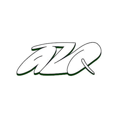
|
| Fig 1.9 Final Artwork JPG, Week 6 13/05/23 |
Task 2B: Collateral
Animation
Collaterals
AZQ Instagram
FEEDBACK
Final Key Artwork Submission
Colour Palette

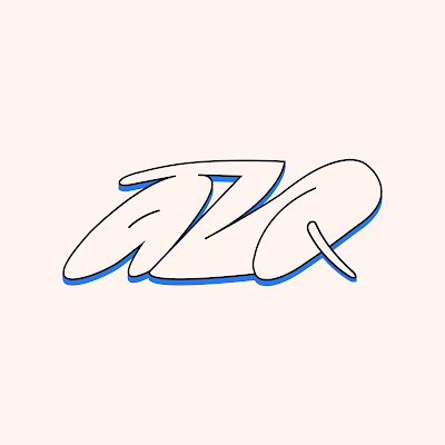
|
| Fig 2.1 Final Key Artwork with Colour JPG, Week 7 18/05/23 |

|
| Fig 2.2 Final Key Artwork with Colour, Week 7 18/05/23 |
|
| Fig 2.3 Final Key Artwork with Colour, Week 7 18/05/23 |

|
| Fig 2.4 Key Artwork Colour Palette, Week 7 18/05/23 |
Animation

|
| Fig 2.5 Final AZQ Animation GIF, Week 7 18/05/23 |
Collaterals

|
| Fig 2.6 Final AZQ Cap JPG, Week 7 18/05/23 |

|
| Fig 2.7 Final T-Shirt Design (Front), Week 7 18/05/23 |

|
|
Fig 2.8 Final T-Shirt Design (Back), Week 7 18/05/23 |

|
|
Fig 2.9 Final Sketchbook, Week 7 18/05/23 |

|
|
Fig 2.10 Final Business Cards, Week 7 18/05/23 |

|
|
Fig 2.11 Final Poster Design, Week 7 18/05/23 |
AZQ Instagram

|
| Fig 2.12 Screenshot of Instagram Feed, Week 7 18/05/23 |
Fig 2.13 Final Task 2 - PDF, Week 7 18/05/23
IG Handle: a4z2q
FEEDBACK
Week 5
General Feedback:
a. For the "azriq": Space out the lettering as the readability for other
people reads it as "aziq" or "ariq" instead.
b. Overall, play around more on the texture of the strokes to convey the
"raw-ness" of the letters.
c. From row 2, column 3: The logo is nice but need to make it more raw.
d. For the 4th logo from the 3rd row: Add more texture to the logo.
Week 6
Specific Feedback:
For Design 1: Make the letter A more clearer.
For Design 4: Straighten the letters on the baseline. Make the
letters Z and Q more clearer. The concept is good but need to figure out
the rationale/personality.
REFLECTION
Experience
Doing Task 2A was very fun as you get to experiment making a key artwork
using the letters from our names. From "Azriq", I specifically used only 3
letters which were "a", "z" and "q".
Observation
The challenging and interesting part of this task was to have an
"identity" for yourself. I came up with a lot of different designs that
could fit my aesthetic and when I took a step back, some of them had some
similarities. From there, I started to work around those options and try
to make it aesthetically fit my identity and most importantly, is
readable.
Findings
Doing this task was a really good way on knowing your identity and what
kind of direction you want to go as a designer, brand, etc. I'd say it
benefits a lot.
FURTHER READING

|
| Fig 3.1 The Viggeli Canon by Massimo Vignelli |
Pages 48-52
Grid For Books
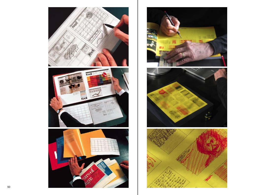
|
| Fig 3.2 Grid For Books (Page 50) |
The grid offers structure and coherence from cover to cover when it comes to book design.
A picture book's grid may have several columns and subcolumns, depending
on the content, to properly organize the material. The size of the book
will be decided initially, in accordance with its content. According to
the best approach to present the information, a book with square
illustrations will be square, and a book with rectangular illustrations
will be either rectangular or oblong.


Comments
Post a Comment