01/09/23 - 01/12/23 / Week 1 - Week 14
Azriq Anwar Bin Saprudin /
0353272
Publishing Design / Bachelor of Design (Hons) in Creative
Media
Final Compilation and Reflection
LINKS
FINAL SUBMISSION
Task 1: Exercises
Exercise 1: Text Formatting
Fig 1.1 Text Formatting
Exercise 2: Mock-up Making

|
|
Fig 1.2 Size exploration
|

|
|
Fig 1.3 Final chosen size - 194mm x 255mm
|

|
|
Fig 1.3 Final book mock-up
|

|
|
Fig 1.4 Interior Final book mock-up
|
Exercise 3: Signature Folding Systems

|
|
Fig 1.6 Signature Folding System (Open)
|

|
|
Fig 1.7 Signature Folding System (Binded)
|
Exercise 4: Van de Graaf

|
| 1.8 Van de Graaf |
Fig 1.9 Zine layout print
 |
| Fig 1.10 Zine Printing (Binded) |
 |
| Fig 1.11 Zine Printing (Open 1) |
 |
| Fig 1.12 Zine Printing (Open 2) |
Exercise 5: Determining Grids
Fig 1.10 Determining Grids
Task 2: Content Generation
Fig 2.1 Content Generation for book
 |
| Fig 2.2 Visual 1 |
 |
| Fig 2.3 Visual 2 |
 |
| Fig 2.4 Visual 3 |
 |
| Fig 2.5 Visual 4 |
 |
| Fig 2.6 Visual 5 |
 |
| Fig 2.7 Visual 6 |
 |
| Fig 2.8 Visual 7 |
 |
| Fig 2.9 Visual 8 |
 |
| Fig 2.10 Visual 9 |
 |
| Fig 2.11 Visual 10 |
 |
| Fig 2.12 Visual 11 |
 |
| Fig 2.13 Visual 12-16 |
Fig 2.14 Visuals PDF
Fig 2.15 Visual Thumbnail PDF
 |
| Fig 2.16 Visuals Thumbnail 1 JPG |
 |
| Fig 2.17 Visuals Thumbnail 2 JPG |
Task 3A: Book |
| Fig 3.1 Final Book Thumbnail 1 |
 |
| Fig 3.2 Final Book Thumbnail 2 |
 |
| Fig 3.3 Final Book Thumbnail 3 |
Fig 3.4 Final Book Thumbnail PDF
Fig 3.5 Final Book Spreads PDF
 |
| Fig 3.6 Final Book Cover (Front) |
 |
| Fig 3.7 Final Book Cover (Back) |
|
 |
| Fig 3.8 Half Title |
 |
| Fig 3.9 Full Title |
 |
| Fig 3.10 Contents and imprints |
 |
| Fig 3.11 Chapter 1 spread 1 |
 |
| Fig 3.12 Chapter 1 spread 2 |
 |
| Fig 3.13 Chapter 2 spread 1 |
 |
| Fig 3.14 Chapter 2 spread 2 |
 |
| Fig 3.15 Chapter 2 spread 3 |
 |
| Fig 3.16 Chapter 3 spread 1 |
 |
| Fig 3.17 Chapter 3 spread 2 |
 |
| Fig 3.18 Chapter 3 spread 3 |
 |
| Fig 3.19 Chapter 3/Interlude spread 4 |
 |
| Fig 3.20 Chapter 4 spread 1 |
 |
| Fig 3.21 Chapter 4 spread 2 |
 |
| Fig 3.22 Chapter 4 spread 3 |
 |
| Fig 3.23 Chapter 5/Interlude spread 4 |
Fig 4.1 E-book Thumbnail PDF
 |
| Fig 2.2 E-book thumbnail JPG 1 |
 |
| Fig 2.3 E-book thumbnail JPG 2 |
 |
| Fig 2.4 E-book thumbnail JPG 3 |
 |
| Fig 2.5 E-book thumbnail JPG 4 |
 |
| Fig 2.6 E-book thumbnail JPG 5 |
Fig 2.7 E-book PDF
 |
| Fig 2.8 Cover |
 |
| Fig 2.9 Table of contents |
 |
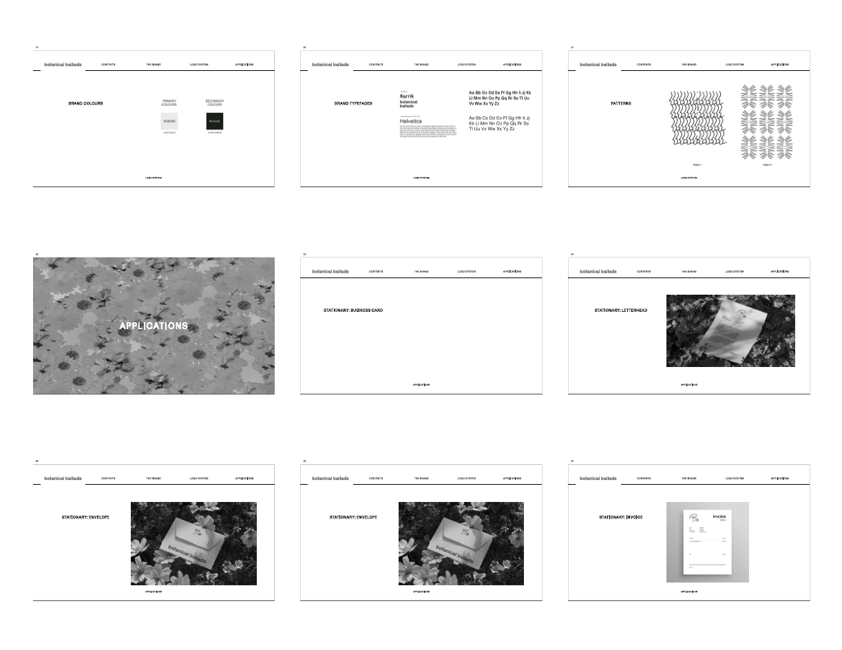
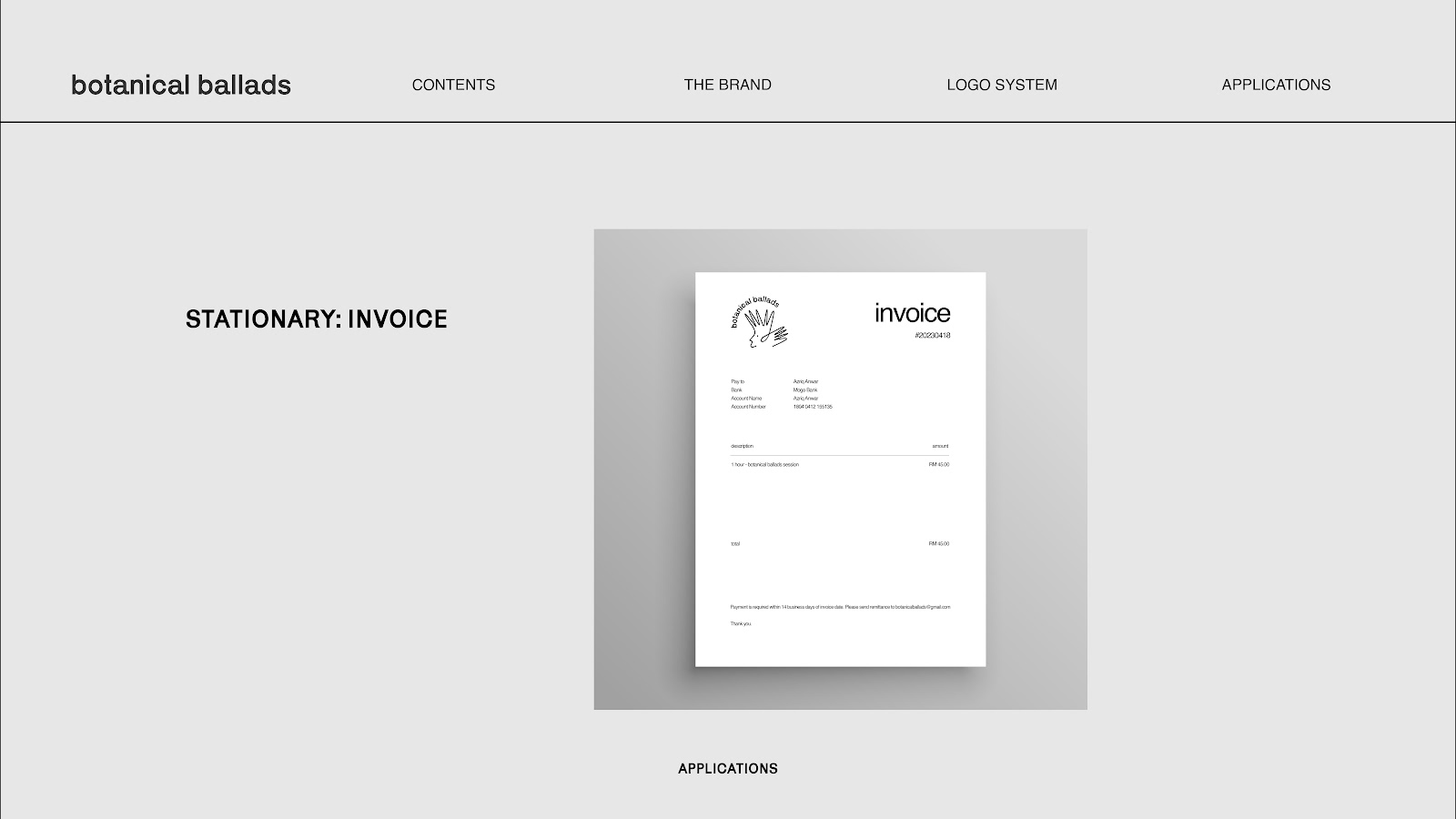
| Fig 2.10 The Brand 1 |
 |
| Fig 2.11 The Brand 2 |
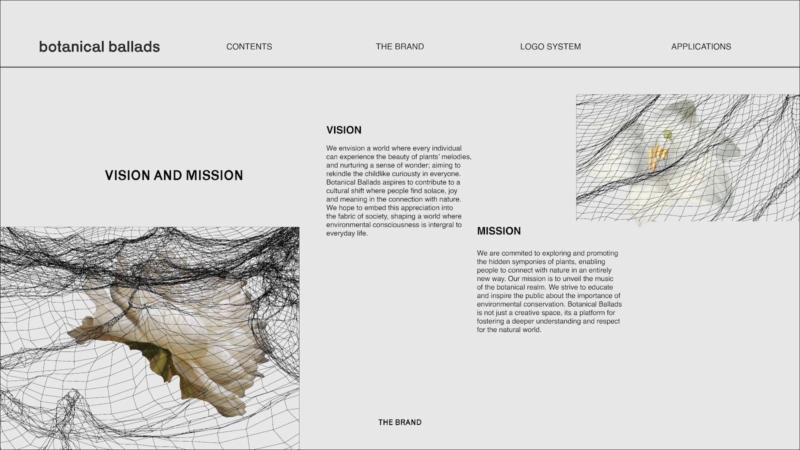 |
| Fig 2.12 The Brand 3 |
 |
| Fig 2.13 The Brand 4 |
 |
| Fig 2.14 The Brand 5 |
 |
| Fig 2.15 The Brand 6 |
 |
| Fig 2.16 The Brand 7 |
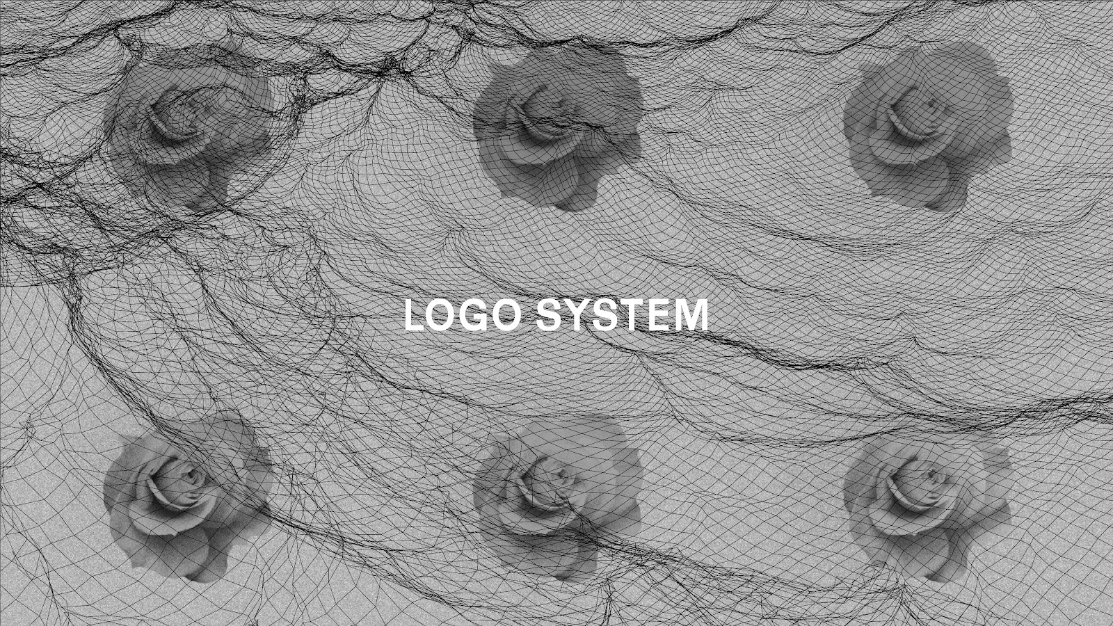 |
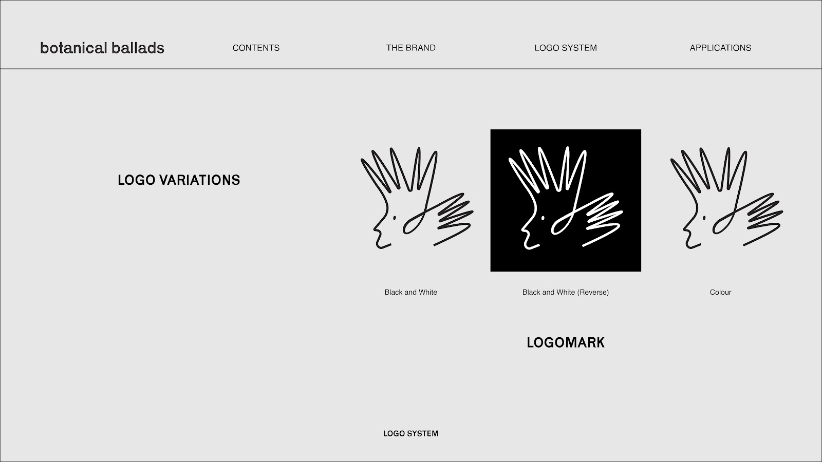
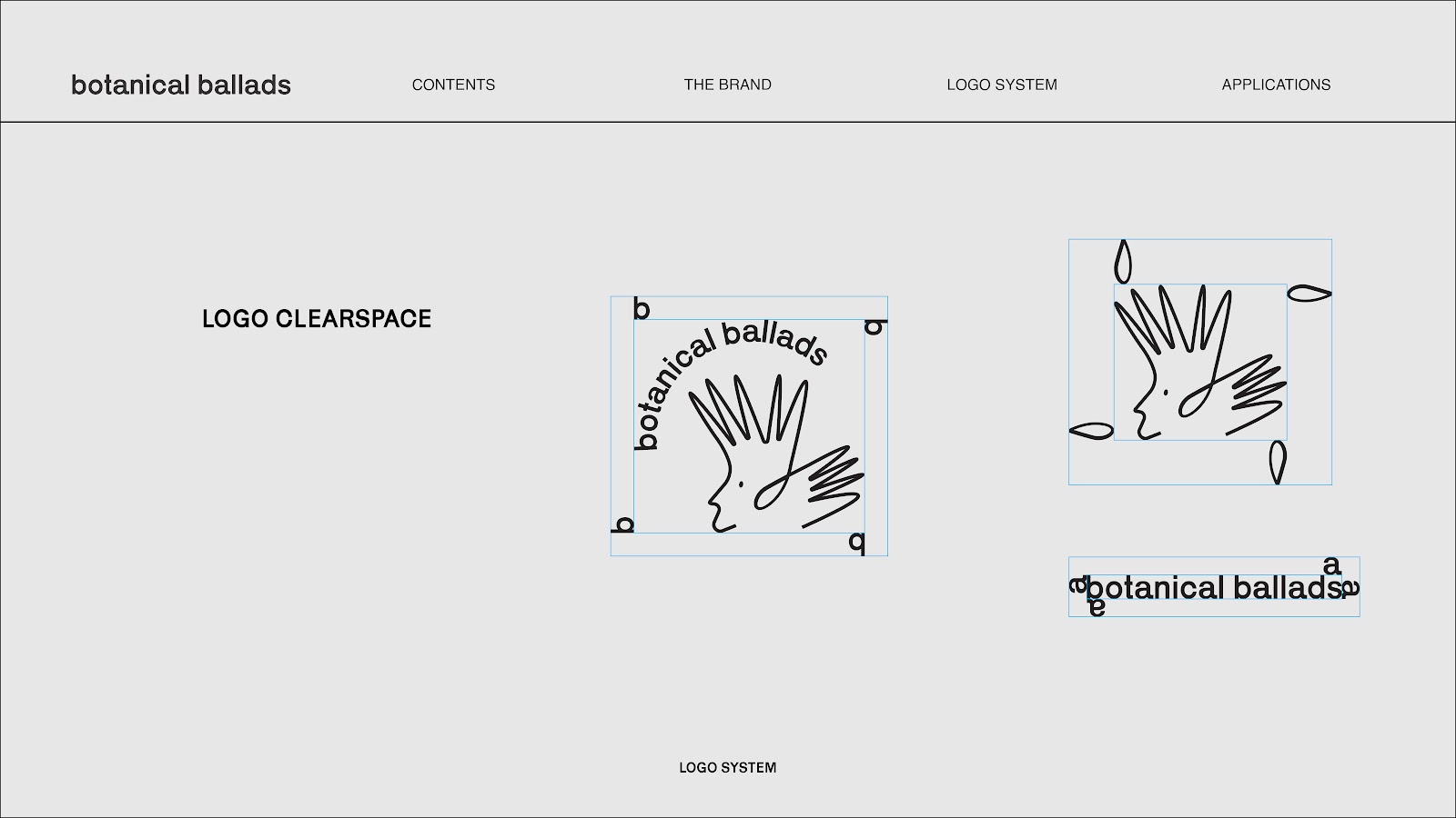
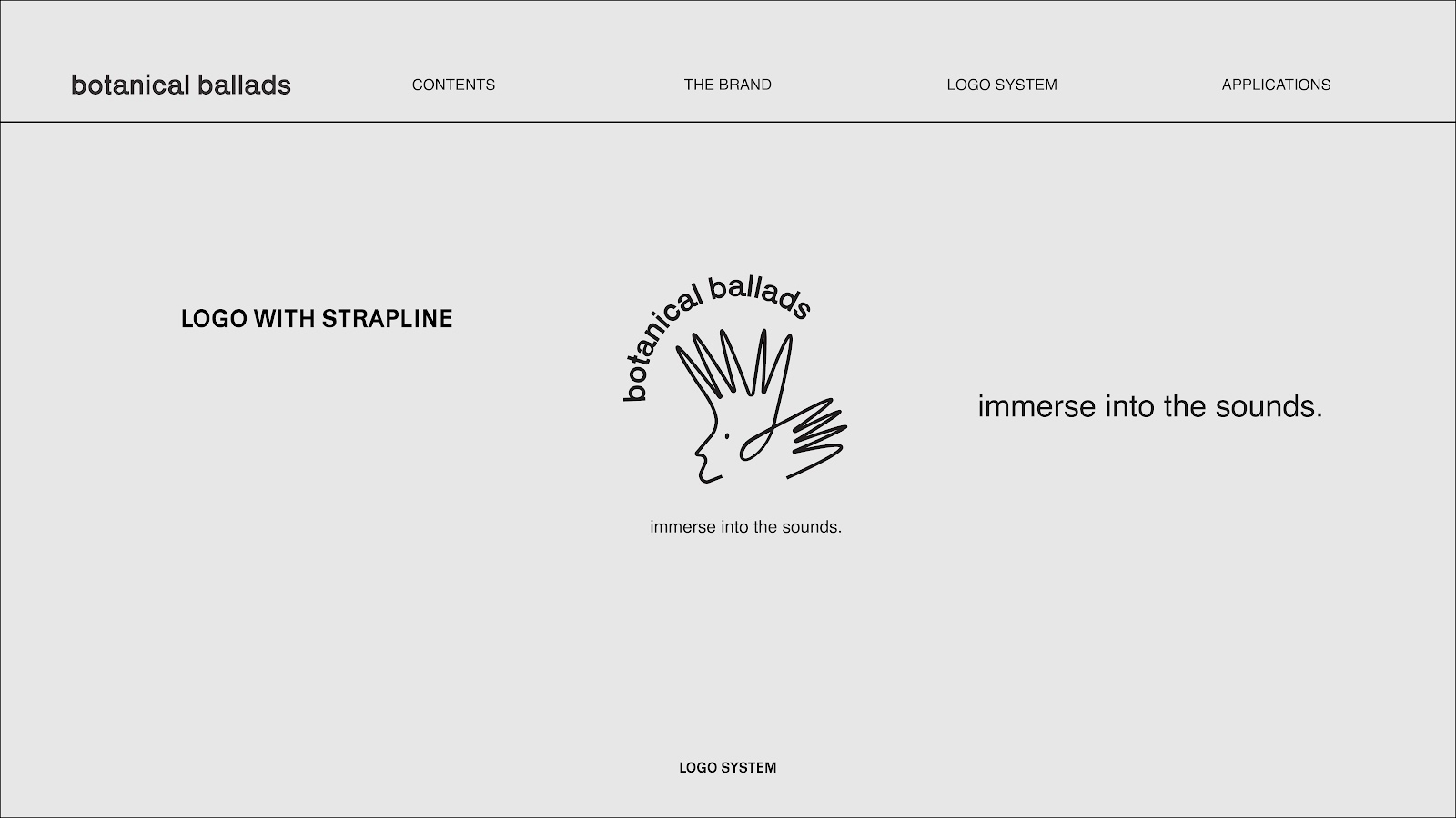
| Fig 2.17 Logo System 1 |
 |
| Fig 2.18 Logo System 2 |
 |
| Fig 2.19 Logo System 3 |
REFLECTION
ExperienceOverall, I enjoyed doing work in this module very much. First of all, because I had the opportunity to write about a topic that has been floating in my mind for a long time. The visuals that I worked on for felt interconnected with each other which tells a story when viewed carefully. This module was a great leap of understanding the ways of making a book. I very enjoyed the book making, the trial and errors. But when it comes to printing, it was satisfying to get everything you did printed into its final form. Trying out the different layouts as I wanted to do modular layouts was fun. Like puzzle pieces, you need to arrange it in a correct possible for it to work. This module helped me practice on designing a brand identity. A brand identity of a brand that I had created myself. The module made me figure out what works best for a brand in a particular way depending on its brand.
Observations
Throughout this module, I looked and seen so many book layouts for references. I had a hard time on choosing the preferable layout and font but it worked out in the end. While doing the visuals, listening to a certain type of music helps with the process. So, I spent a few weeks just listening to a set of songs from the band, Radiohead. It helped me achieve the aesthetic of the overall look I was going for. All the trial and errors was fun, trying to figure out the right way to do modular layouts. Understanding the comments Mr. Vinod gave me helped very much in the process. Because I wanted to fit the aesthetic of the illustrations with the layouts. Gist of the book was about displacement so I wanted to emphasis that further in the grid layouts. I saw that everything plays a role on making a brand. And I saw how important visual elements were when forming a brand identity. From white spaces to visual appeal.
Findings
Gaining what I've learned from this module, it broaden my knowledge on publishing in general. I found that in the process of making visuals, there's a need of consistency especially designing a book. Also, doing this task expended my work rate and didn't burn out as much as I did before. I find that if one piece of chunk of texts wasn't aligned, I had to rearrange everything from the start. It was quite frustrating but when figuring out which texts goes where, it was satisfying. I found that the combination of design elements makes an important role in publishing design. When doing the interactive part, I found that it was very important for the user to have easy accessibility.


Comments
Post a Comment